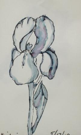
There was a ruffled iris among the blue iris in my daughter's garden. It wasn't quite pink or bronze, it had undertones of purple but also yellow. I guess if you mix a purple and yellow you get a brown color but this was a prettier color and very difficult to duplicate. The fuzzy things, whatever they're called were bright orange. I added watercolor to my pencil sketch, unfortunately I didn't have my watercolor Moleskine but a little sketchbook and the paper was pretty thin and crinkled from the water. It makes for a nice memory of my time at our daughter's house.
Monday, May 24, 2010
Sunday, May 23, 2010
Spring
I finally got a taste of a non-tropical spring while visiting our daughter in Portland, Oregon. She had beautiful iris in her garden that were begging to be sketched. I did this one with an Elegant Writer, a calligraphy pen that is not permanent. When you touch water to it you can get lovely shading and even some variation in color.
While we were there we went to the Portland Rose Garden and even though most of the roses were not quite ready to bloom, there were a few early ones that were stunning. With all the photos I took I'll have a lot of references to work with.
Labels:
Elegant Writer,
garden,
iris,
Oregon,
Portland,
roses,
spring,
spring flowers
Thursday, May 13, 2010
More Blue Herons
Blue Heron on the Beach
Acrylic on 5 x 7 Canvas Boards
I'm still in the heron painting mode. It seems these little canvas boards lend themselves to this type of painting. Sometimes people just want to take home a little momento of something from their trip to Florida. This is what I'm hoping, anyway. Now to find some simple frames to set them off and I'm good to go to the gallery with them.
Friday, May 07, 2010
Blackbird Has Spoken
I can't believe how long it's been since my last post. I must be busier than I think. Sometimes I have several works going at the same time and nothing is finished. This little acrylic had a layer of bead gel on it at first which I didn't care for so I covered it over with molding paste and made some designs on it. I didn't have a plan, I was just playing with it and trying to make it interesting. When the molding paste dried I started painting it and finally came up with a sunrise, moon set motif and the song "Morning Has Broken" came to mind. With that on my brain I had to have a blackbird. I found a blackbird picture and made a gel transfer. If you've ever made a gel transfer you know this takes lots of layers of gel medium on the picture and this can take several days for the layers to dry and get thick enough. Finally I rubbed the paper off and was able to cut my blackbird out and fasten him to the painting. I did have to darken him with black paint though, I didn't think the transfer turned out dark enough.
Labels:
acrylics,
blackbird,
gel transfer,
molding paste
Tuesday, April 27, 2010
The Gallery with Happy Colors

The gallery owner, Peggy McTeague, wanted a picture of her gallery painted and printed on card stock. I painted the front of the WildChild Gallery from a picture that I took since to sit in the street and paint would be a very dangerous thing to do. I painted it on paper with acrylic paint. I wanted to try to paint with acrylics in a watercolor style. It was an interesting experiment and I think it worked out quite well. You may wonder at the bright exterior color. This is a common thing to do in this area; it's a Caribbean influence, I think. The brightness of the sun seems to beg for bright colors. Dark earth tones just wouldn't do. People show up in their blacks and tans from the North and before you know it, they are sporting colorful outfits, too.
Labels:
acrylics,
Caribbean,
watercolor,
Wildchild Gallery
Monday, April 26, 2010
Sea Shore Heron 2
Friday, April 23, 2010
Sea Shore Heron
I'm determined to get my mini paintings done for next year so that I don't have to scramble to get them handed in on time. I have some good photos that I took of a heron walking on the beach so he's my subject this year. People were asking for more bird pictures this year so I hope that's what they want in 2011. This is the first of four that I finished. It's done in acrylic on a 4X5 canvas board. It's pretty small by my standards but that's the size we are required to do. I find it easier to paint that small with acrylic as opposed to watercolor. I guess it's easier to correct mistakes by painting over them.
Labels:
acrylics,
heron,
mini paintings,
sea shore
Thursday, April 15, 2010
Undersea Step 3, 4
When I looked at step three I thought the turtles didn't look like they were underwater and that the bottom of the sea wasn't integrated with the rest of the picture. The solution, I thought, would be to give it all a wash of Thalo blue, green shade. When I did that, I lost all my vibrant colors that I loved so much about the painting. Since then, I've been trying to regain some of the vibrance without making it look like everything is pasted on a background. I've never had so much difficulty with this kind of painting. Now that I'm showing it to the world, I'm having problems. It just serves to remind me not to take myself too seriously. It's only paper and pigment, get over it! The outcome will be posted soon.
Labels:
turtles,
undersea,
watercolor
Wednesday, April 14, 2010
The Auditorium

I painted this for http://virtualpaintout.blogspot.com. The assignment was to paint a scene from the Canary Islands, off the coast of Spain. I found this scene on google maps.
This is an amazing building; an auditorium in Tenerife. From the angle that I painted it looks like a huge ocean liner. You can tell it's size by comparing the size of the car. I'm not very good at cars so I only painted one. Also, there are two tiny figures towards the back on the right side. The people look dwarfed by this building. It looks like it's all white so what I'm painting is the shadows on the sides, quite fun. The view from the side of the building (maybe someone else will paint that) the building reminds me of a giant conquistador's helmet.
Tuesday, April 13, 2010
Organizing magazine articles
It must be a spring thing, I've finished a project to preserve the art magazine articles that I really like. I came to the conclusion that in order to avoid renting a warehouse for my art things I have to pare down some things. The first thing I decided to tackle is my collection of years of art magazines. Each month each exhibitor is required to staff the gallery at our art league for one afternoon. In between talking to guests I began going through my magazines and cutting out the articles and artwork that I really liked. These were put in sheet protectors and put in a ring binder. I ended up with two ring binders, but it's much better and more organized than a stack of magazines. I can easily find subjects or artists by going to the appropriate section. It took quite a few afternoons over several months but I'm finally finished up to 2009.
P.S. I'm still working on the Undersea painting, too.
Labels:
art magazines,
articles,
organization
Tuesday, April 06, 2010
Undersea, step 2
In step 2 I'm beginning to define the undersea elements; the shells, rocks and coral shapes. I've also found some jelly fish shapes that I will try to use to make some more interesting shapes besides the turtles that are beginning to show up. I think the colors are very pleasing and I am going at it slowly. I love this part of the painting, doing the negative shapes and making the subjects come alive. At least that is what I hope to do. I'm finding little fish peeking out behind coral and others in the light area. I'm really enjoying this process.
Sunday, April 04, 2010
Wave Boarders
While at Daytona Beach with the grandchildren this week end I got my little paint box out and painted some wave scenes. The kids were having such fun with their wave boards riding the waves into the shore. I painted this little scene for them to take home as a souvenir. They are the two on the left. There were a lot of kids out there in that cold water; at least to me 65 degrees is too cold to swim in but they didn't seem to mind. The day was partly sunny, but perfect for beaching.
Labels:
beaching,
Daytona beach,
watercolor,
wave boarding
Tuesday, March 30, 2010
Undersea, step one.
This is step one for an undersea painting I started a few weeks ago. I wet the paper on both sides and while it was really wet I started adding the colors. Then I added various items to make textures; torn wax paper, coffee filters, rice papers, and gauze for the stringy stuff. This is my favorite way to make an under painting or background. I planned ahead that it would have turtles, fish, coral, shells and rocks. I have used salt for texture, too but I'm getting away from that because I've been told that it will attract moisture, especially in our FL humidity.
I have another picture of it as it has progressed and will post that tomorrow.
Sunday, March 28, 2010
Those Piles of Old Paintings
I have what my son calls "lots of inventory". Sometimes I look through it for ideas and to evaluate what went wrong, what worked. I did a half sheet watercolor of pink poppies years ago and it was nice but not too exciting. As I looked at it I thought the three poppies near the top would look nice framed by themselves. I cut them right out of the picture and darkened the sky around them. I think they will make an attractive note card and a nice 8X10 piece. Perhaps I can try a Myrna Wacknov experiment with the rest of the painting, a little gesso, a little collage and who knows? It may turn out good or it may just be a fun exercise.
Labels:
inventory,
old paintings,
poppies,
watercolor
Friday, March 26, 2010
Orange on Found Paper
I started my painting session yesterday at the Art League by finding some donated paper. I wasn't sure what it was so I decided to do a 20 minute challenge with it. One of the artists brought juice oranges to share and I decided that would make a good subject. As I began my painting I noticed that the water in my paint was being sucked up by the blotter-like paper. Indeed, if my brush was really wet, it soaked right through the paper. Since the pigment doesn't lay on the surface more than a nano-second, it's very difficult to blend colors on the paper. I worked in layers, instead. I think the paper is for print making. I may try a mono print on it and see how it works out.My scan of the painting is more vivid than that of the actual painting, I noticed the same thing with the pears. I tried to adjust it with my picture program but wasn't happy with any of the results. Does anyone have any ideas that aren't too technical? Thanks.
Labels:
20 minute challenge,
oranges,
print making,
watercolor
Sunday, March 21, 2010
Stavanger, Norway 2
This is another little painting that I did for the Virtual paint out blog. The assignment was Stavanger Norway and I found this house on the water with what must be a wonderful view. It's hard to see on my painting but there was even a bridge between the far hills. I love the simplicity of the house nestled down off the road and close to the water. I wonder if there is a boat of some kind moored back there out of view. This has been a lot of fun to go to a virtual place and paint. I have really enjoyed the trip, especially since I know it is winter there and probably not nearly so green. I've enjoyed seeing the scenes that others have painted, too.Wednesday, March 17, 2010
Pears in a Bag
These pears were so pretty when I brought them home that I tore open the bag and had to paint them. I left them nestled in the bag and decided to paint them for the 20 minute challenge. I set the timer and did a quick sketch. I was amazed at how much I could paint in twenty minutes. I had to blast them with the hairdryer when things got too wet and out of control but when the timer beeped, I was OK with being done.
Labels:
20 min challenge,
pears,
watercolor
Monday, March 08, 2010
20-30 More Minutes
I couldn't leave it at 20 minutes, it was too wishy-washy for me. I had to go back in today and punch up the colors. But the leaf on the lower left has too many veins in it, I got a little carried away with the scraper. When I do another 20 minute painting I'm going to remember to really lay the pigment in so that it doesn't turn out so washed out. I guess that's what the exercise is all about, learning each time to you do something.
Sunday, March 07, 2010
Sea Grape Leaves- 20 minutes
I've been wanting to do the 20 minute challenge for quite some time and finally determined that today was the day. I love painting sea grape leaves, they are as big as saucers and range in color from green to red to orange and finally brown depending on the season. The new leaves are reddish orange and almost translucent. The older leaves start getting a red tinge on the edges. The veins on the top of the leaf are yellowish, on the underside are red. I had to trim the bushes anyway, so I brought in a branch, set the timer and painted for twenty minutes. I wanted to tweak my painting a little more but, in the spirit of the 20 minute challenge, I did not. This is it, no editing or retouching. There's really no excuse for not painting at least 20 minutes everyday if perfection is not the goal, just painting. See it posted along with other 20 minute paintings at http://twentyminutechallenge.blogspot.com/
Labels:
20 minute challenge,
sea grape leaves,
watercolor
Thursday, March 04, 2010
Stavanger Norway

After a hectic week of being in charge of one of our local art league's show it was good to have a class so that I could have some time to paint. It's so nuts to do everything about painting and not actually have time to paint! Last night I spent some time finding a scene to paint by searching Google Maps. The assignment for the Virtual Paint Out blog was to paint a scene from Stavanger, Norway. I was in Norway in 1994 and loved it; it is such a beautiful and rugged country. Besides that, my mother's ancestry is Norwegian. I wanted to find a cottage by a fjord to paint. That was not so easy but I found a few lovely scenes and will be posting what I have painted here and at www.virtualpaintout.blogspot.com. Even though the little cabin or boat house in the picture was brown, I had to paint it red. I just love the red houses in Norway. I was told that they painted them red so that the sailors could identify their house and port in bad weather.
Labels:
Norway,
red cottage,
Stavager,
virtual paint out,
watercolor
Subscribe to:
Posts (Atom)