Thursday, May 23, 2013

Still More Collages

Fantasy
4 X 6 Collage on mat board

I started this collage on a dark green mat board and that background influenced the colors of the collage papers that I put on top. I ended up using some opaque papers and paint at the end so that everything wouldn't appear so dark. Lesson learned; put your collage on the white side if you want your translucent papers to show up. 


Unexpected
4 X 6 collage on mat board
On this collage I used a combination of manufactured papers and some that I made myself. The leaf is a sticker embellishment, the quote is from a fortune cookie (collagers save everything). 
I did some accenting with acrylic dimensional paint and some stamping. Click on the picture to get an enlargement to read the fortune.


Red Bird
4 X 6 Collage on mat board

This little bird keeps showing up. Now he's contemplating why a checker board is under his nest. All of the papers used in this collage are manufactured tissue paper, napkins and art papers.

Like me on facebook: Jan Werdin Art/facebook
                                     

Friday, May 17, 2013

A Few More Collages

Eiffel Tower
4 X 6 collage on mat board

I'm still not tired of doing the little collages. This one has pieces that were copied on a ink jet copier. I have found that the Epson ink doesn't smear like other printers do and I've been told it's because theirs is pigment based instead of dye.   Some of the papers were stamped, some are pieces of napkin. I added some gold stamping in the top right corner. I like a little shine to my work.

The Golden Egg
4 X 6 collage, with acrylic and ink

This little bird seems to be puzzled but happy about the golden egg. It's another combination of napkin papers and hand painted papers. There is also a little gold acrylic stamping around the edges.

Scrable Rules
4 x 6 collage with acrylic

This collage was done with all manufactured papers. The quote was cut from a magazine ages ago. If you click on the picture you'll be able to read the quote more clearly. This also has the gold stamping on it.

I've been scanning these collages into my computer and designing note cards. I'm very happy with the results. Go to www.facebook.com/janwerdinart  and see how you can win a set of note cards.

Monday, May 13, 2013

Collaging

    Paris Lady 
4 X 6 collage on mat board


The past couple of weeks I've been making little collages on 4 X 6 pieces of mat board. It's been loads of fun and has really sparked my creative juices. I have so many papers stockpiled it's about time I used them. Most of them are papers that I have purchased, and napkins. I also have pictures I have copied on my printer such as the one in this collage and papers that I have painted. 

Leaf and Dragonflies
4 X 6 Collage with acrylic

This is one of my favorites, I love using the leaf skeletons and who doesn't like dragonflies? The paper on the bottom is something I colored with watercolor, the top is a commercial paper with threads sewn into it. I used a dimensional gold acrylic to embellish the dragonfly and the top. 

Life Is Not Measured
6 x 6 collage with ink and acrylic

I loved this quote that I found on a pack of napkins so I built my collage around it. The olive branch reminds me of the Mount of Olives in Jerusalem and the butterfly is often a symbol of new life, moments that take my breath away.   


Tuesday, May 07, 2013

Sunset Sail 
Watercolor on Yupo synthetic paper, 20 X 3.5

This is my second entry into the Regatta show. Painting on Yupo is much like painting on the acrylic surface I wrote about in my last blog. I'm able to carve out my white areas with a damp brush. What I find difficult about painting on Yupo is that the paint moves so much before it dries if there is a lot of water in it. So, there is a decision to make; in order to have bright transparent colors I add more water so it's a tea or coffee consistency. But, if I want the pigment to stay put I have to put it on like heavy cream and then it's less transparent. So, I wait for the paint to dry, assess the outcome and, if it needs adjustment, I go in with a damp brush and remove what I don't like and then put in what I think I will like better. Then, the paint does what it wants to do anyway, control is out the window! Never  mind. This process is too much fun!

Thursday, April 25, 2013

Regatta 2013


                                           Catching the Wind
                       Watercolor on acrylic on illustration board, 15 X 20.


It's time again to put forth a painting for our annual Regatta show at Cape Coral Art League. I'm continuing to try to do something experimental with my work. I don't want to do the "same old, same old" but push the boundaries of the conventional rendering of sailboats. I coated my board with gesso and used molding paste for some texture in the bottom third of my painting. This dried completely. Next I put in my blue sky and water background. After that dried I was able to carve out the sail shapes with a damp brush back to the white of the gesso. I continued with the darker boat shapes. I went back into the sails to create the contour with shadows and added people shapes. Finally, I carved out the small sailboat in the distance. This painting went surprisingly quickly because of the gesso underpainting. It allows me to  make corrections as I go along simply by wiping out and adding paint. 

Monday, April 15, 2013

I Might Fall

                                                  I Might Fall
                                       18 X 18 Acrylic on Canvas

I covered an old painting with gesso and put tissue paper into the wet gesso. After the gesso dried I covered the whole canvas with polymer medium to make sure that all the tissue was securely stuck down. When that dried I looked at the pattern of the tissue and thought it looked like a tree form that was slanted so that's what I went with. I used a palette knife to dab on the yellows, oranges and green leaves and the browns of the tree trunk. Most of the rest of the painting was done with a brush. It's spring and not autumn, so it's a little strange to be painting a fall tree but when you live in Florida you are never quite sure of the seasons anyway, except the long, hot summers. 

Friday, March 29, 2013

Lion's Gate-Jerusalem, Israel

                                          Lion's Gate-Jerusalem 
Watercolor, 15X22

I finished the painting that I started in the workshop but I finished it mostly in my own method.  I did try to use some of the new things I learned in the workshop such as paint strength and color blending. In the end I tend to go back to what I know best. I'm sure I will incorporate what I learned into my work. I love my sable brushes now that I know how to use them and using soft paint is so much easier than digging out diluted paint from a hard, dry palette. 
The photo that I used was from our trip to Israel several years ago. The gate was built in the 1500's and is also called St Stephen's gate. It is believed that Stephen was martyred outside that gate area. Of course the gate to the city in those days has been long gone and this gate is "new". It's a double gate, and leads to the old city with buildings beyond. It's called Lion's gate because of the lion figures carved on each side of the gate. 

Wednesday, March 27, 2013

Workshop Recovery

Last week I was in a workshop for four days. I've needed that and more to recover. It's daunting to be in a learning mode for four days if you've been out of school for decades. The artist was Marie Natale from New Jersey. She is a wonderful watercolorist and teacher. She recommends sable brushes which I have but seldom use. I love them now that I've learned how to use them. We learned the 5 "strengths" of watercolor; tea, coffee, milk, cream and butter and how to apply them. 

This little landscape illustrates the use of the different strengths of watercolor pigment. 
I'm not finished with my large painting that I started in the workshop. I will keep working on it and hope to have it posted soon. In the meantime try this little landscape for yourself. Here's a link to Marie's web site.   www.MarieNatale.com

Friday, March 15, 2013

Write It On Your Heart.

I saw a challenge on the artists in blogland that I couldn't resist. It was to paint something to go with the quote, "Write it on your heart that everyday is the best day of the year." Ralph Waldo Emerson. I really liked that quote and started playing around with some ideas. The final painting I put on a gallery wrap canvas.


Write It On Your Heart, acrylic, 8 X 8


I began by painting my idea in my journal pages. The page on the right was watercolor over a gesso page with permanent marker lettering. The page on the left is what I did with my left over paint after finishing the acrylic painting on the top. I like the looseness and spontaneity of that one a lot. 

I love the quote because it's so true. We only have today, yesterday is gone and tomorrow is not yet ours. All we have is TODAY. How much of my time is spent in thinking what I will do tomorrow instead of living in my today. 

If you want to see the rest of the artwork related to that quote go to http://artistsinblogland.blogspot.com  and click the Monthly Challenge button on the right side.

Sunday, March 03, 2013

                                              On the Prairie
                              Acrylic on paper with collage , 15 X 15 

This painting reminds me of the time I spent at my grandmother's house on the prairie of South Dakota. It has a desolate feeling to it. There are the vast stretches of prairie land with a lone house in the distance with a red sunset sky. I can almost feel and hear the wind blowing. Maybe I should add a windmill. What do you think?

Saturday, February 23, 2013

Recent Awards

I won 3 awards in recent local art shows so I thought I'd share them on my blog.
 
 
 "Gone Ashore"
 
This was in the Small World category where a painting must be no more than 24 inches square; so they are very small paintings, indeed. This painting was sold.
 
Happy Walk
 
I posted this one earlier on my blog. I'm very pleased with the 3rd place ribbon in the mixed media category. Both paintings were entered at the Pine Island Art Association.
 
 
Ghost Ships
 
I posted this one earlier, too. It won a 2nd place award in a show at Cape Coral Art League last week.
 
I was able to sell four paintings in all at the Pine Island show. It was a very good show for me this year. It was a good show for the Association, too. Many paintings were sold in the 2 day event.

Friday, February 22, 2013

Straight and Narrow

                        
                                                      Straight and Narrow 
                                          Acrylic on paper, 15 X 22

I've been working on several projects at once, this one is the first one that is finished. It is a multi-layered abstract on watercolor paper. I had several objectives when I started this painting. 
1. I wanted it to be a cruciform. 
2. I wanted a color other than blue to be dominant. 
3. I didn't want any recognizable form to show up in the painting, for example a flower, fish or face. 
The hardest part was not using blue, a lot of my paintings lately have been blue dominant and I tried to steer away from even using a  blue . I did sneak some in one of the under layers but reminded myself to get it covered up so it's just barely visible. 
Abstracts are fun but take a lot of thought. I do a lot of painting on and wiping off until I get the look I want. Fortunately, once the acrylic is on the paper you can get fairly rough with it without ruining the paper. Even after drying some rubbing alcohol will take a layer or more of paint off if you want to change something. I usually start with a couple layers of gesso on an old watercolor painting so I have a good base to start on. The Quinacridone gold was next followed by reds and purples. Each layer is stamped, scraped, or textured in some way. A little gold and thick drops of acrylic were my finishing touches.

Thursday, February 14, 2013

Still life with lemons


It's been very busy lately since this is "season" here in South Florida. We have our sales and shows while the snow birds and tourists are here. It's a window of opportunity. I had three shows to get ready for since February first. One was a show and sale where I sold 4 paintings and also received 2 awards. That felt really good! Yesterday's show garnered another award! That has left little time for painting since I was also a worker bee at these shows. In addition, our local art league is having a yard sale this week end and I started to clean out some boxes of things in the garage. One of the things I found was this little art glass vase in the shape of an elephant. I couldn't part with it so I decided to paint it in a little still life at our regular Thursday morning class. I love yellow with blue so the citrus was a easy choice to go with it.


                     Elephant Vase With Citrus  Watercolor 6 1/2 x 5 1/2

Monday, February 04, 2013

Numbers 29 and 30


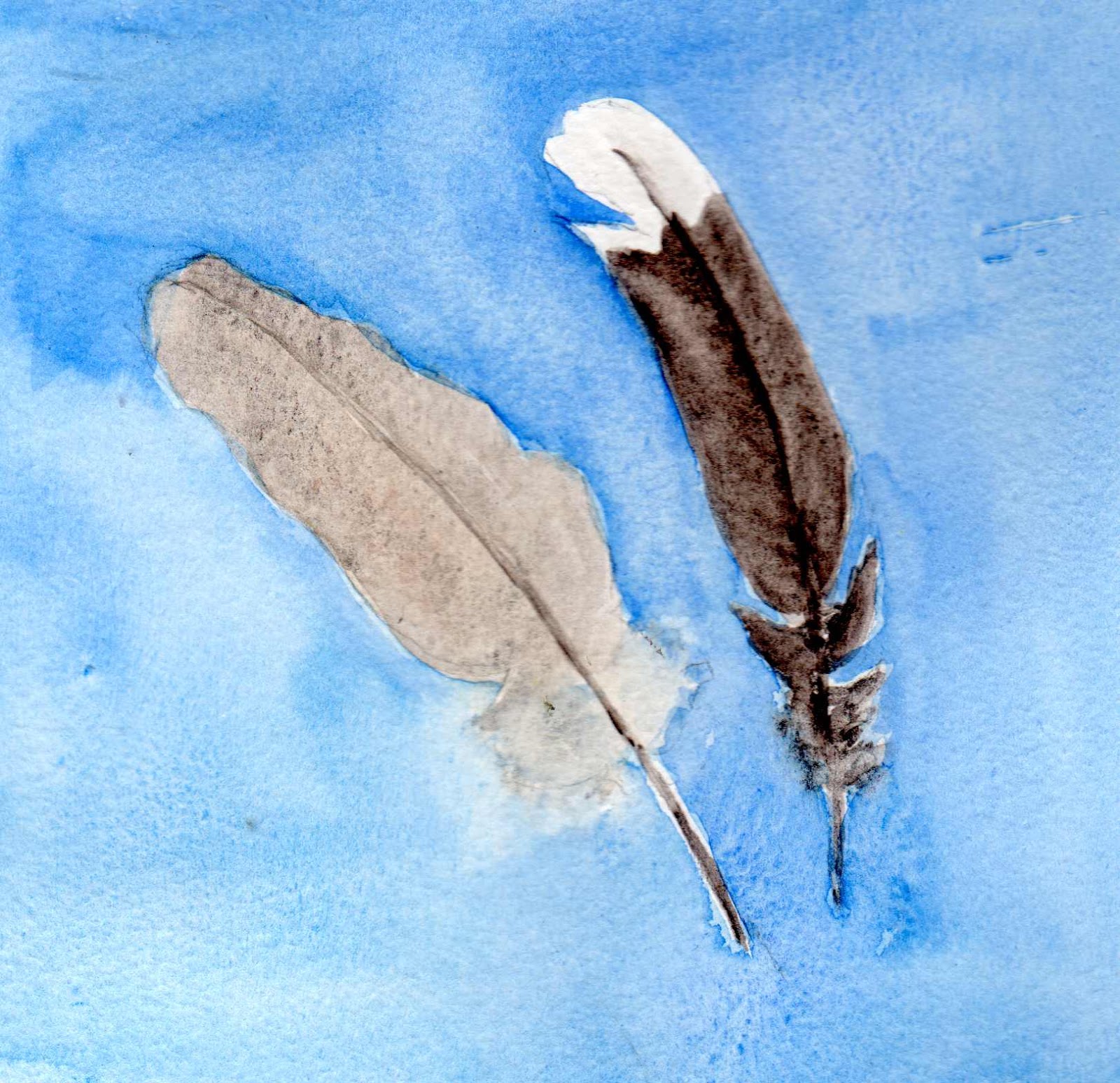
Feathers
Watercolor, 5 X 5

I finally got time to post my last 2 paintings for the 30 in 30. The blog finished on January 31st but I wasn't finished with the 30. I'm a little nuts about picking up found objects and these feathers were found. Maybe one day I'll do a collage and put them in it. In the meantime they were fun to paint. I tried to get the fuzzy, downy part at the base of the feather to look that way by making the background really wet. I think the one on the left is probably from a morning dove and the other a mockingbird. 

                                                           Green Parrot
                                     Watercolor 6 X 8 1/2

As I look over my 30 paintings I see that I have painted more birds than anything else. Birds are interesting subjects, they come in all colors, sizes and settings. I guess that's why I like painting them. I've enjoyed painting consistently over the month of January. It will be harder in February because I have so many shows and sales the attend to. I hope I'll be able to continue to work regularly, though, and post on Leslie Saeta's blog again. She is encouraging artists to post one or two paintings a week each week end. After doing 30 in 30 it should be easy!

Thursday, January 31, 2013

Sail Away and Sunset Stroll, 27 & 28

Sail Away
Watercolor, 11 X 7 1/2

Painting number 27. This idea I found in a magazine illustration that I thought was charming and whimsical. It was fun to try to render it in watercolor. This is the last painting posted in the 30 in 30 blog. Thanks to Leslie Saeta for encouraging so many artists to get into their studios and paint. 
http://lesliesaeta.blogspot.com 


Sunset Stroll
Watercolor 10 1/2 X 7

We do have these wonderful sunsets on the Gulf of Mexico this time of year. Don't we all dream of walking on the beach at sunset with our favorite fellow or gal? 
Even though the official 30 in 30 blog is finished, I still want to finish 30 paintings and I have two more to go. 

Wednesday, January 30, 2013

Sunflower, #26

                                                  Sunflower
                        Watercolor over Textured Acrylic on paper, 10 X 12

I'm caught up! This is my painting number 26 but it's posted on day 29 of the "30 paintings in 30 days blog". The blog has one official day left but I will have 3 more paintings to do to complete 30. This has been challenging but fun. I had to push myself on some days. Some of the paintings were quick and sketchy but the important thing was that I painted every day and that's a good thing. I don't think I've ever painted 26 days in a row before. I'd like to develop some of the ideas into larger, better paintings. 
This painting done on one of my gesso backgrounds was fun to do. I'm getting to like the textured gesso for a background more and more. It's a very forgiving surface to paint on and I think it makes for an interesting painting.

Ambience, #25

                                                   Ambience
                                  Acrylic and Collage on Canvas, 8 X 8

This is Number 25 for day 28 of the 30 paintings in 30 days blog. Since I started 3 days late I will not be able to post my last 3 paintings on that web site, but I plan to finish the 30 paintings anyway. This one is another one that I did in an image transfer class. The canvas has been painted and had different texture elements on it. Then the image transfers and other collage pieces are added to make what I hope is a cohesive painting. The black lines are a combination of collage and black pen. I like the image transfers because they allow the background of the painting to show through.

Tuesday, January 29, 2013

Image Transfers in a Painting, #24

 
                                            Time Watcher,
                              Acrylic on gallery wrapped canvas, 8 X 8

I've been taking a class on image transfer the last three weeks and although this  is not strictly a painting, it has image transfers and collage elements, I'm still counting it as my painting #24 in the 30 Paintings in 30 Days. The background was acrylic over tissue paper for texture. The woman and the clock were image transfers on gel skins, the script and lace are collage. 


Monday, January 28, 2013

Sunset Wash, #23

                                            Sunset Wash 
                                       Watercolor, 15 X 11

I'm learning things as I go along in this daily painting. Sometimes I like to paint on the back of another painting. The back of this painting had a piece of another kind of paper glued to it. I found that this affected the ability of the paper to hold the water and for the paint to blend as I was accustomed. Also, the push back that the water usually does to the paint along the water line didn't work as well, either. I really had to force the issue in order for it to work. I decided to post it anyway, it's not what I wanted or expected but it's what happened.

Sunday, January 27, 2013

After Chiuly II, Number 22

                                After Chiuly II, Watercolor 11 X 7 1/2


I love the abstract quality of the insides of the blown glass bowls by Chiuly. This one was magenta with blue. He puts a layer of white between some of the glass layers; that makes the bowls have so much depth. It's hard to capture that in watercolor but the abstract design is fun to try to duplicate. 

Followers