Sunday, March 06, 2011

Mixed Media Heron


Mixed Media Heron 11x15
I'm finally back to posting. Not only was my bout with the crud long, I had a 4 day workshop in the middle of it. I didn't want to forfeit my payment for it so I dragged myself into the studio and did what I could. There was a day of sort of messing around with acrylics on fresh paper and old paintings. We learned different ways of getting a variety of textures on the paper which would be our under painting. After that there was a lot of emphasis on composition and design. It seems like that has to be drilled into my head on a regular basis because I get these neat under paintings and then I don't know how to develop them into art that really works. I think I work more intuitively but that is so unreliable. I'd like to be able to make a plan and stick to it. Anyway, this heron painting was one of the paintings that came out of the four days. This was done over an old painting and coat of "gesso juice" (1 part liquid gesso, 1 part matte medium, and 2 parts water), textured with a plastic card. The dark blue background is thick watercolor, the heron is gesso juice and watercolor. The workshop instructor was Kathleen Conover. www.kathleenconover.com Look her up, she does very interesting work and I found her to be a wonderful teacher.

Wednesday, February 16, 2011

When Life Gives You Lemons


When Life Gives You Lemons, 11.5x15, watercolor.
This is another still life that I set up and photographed. I love blue and yellow together and I thought this might be a challenging subject to paint. I was right on that! I don't know how the lemon drop jar got a little lopsided but it did. Except for that I like the results. It was done with the same techniques that I learned doing the cherry paintings. The colors are blended on the paper which is 300 lb. cold press. I finished this painting several weeks ago and wasn't going to post it because of the slightly tipsy results but since I have the "crud" that has been going around it sort of describes how I feel; a little tipsy and full of lemons (I drink a lot of hot honey and lemon water). I admire people who can paint when they don't feel well, unfortunately I'm not one of them. I'll know I'm getting better when I feel like picking up the paint brush again.

Wednesday, February 09, 2011

More Cherries

Cherries and Crystal 11x15 watercolor and acrylic
I had to paint some more cherries in a crystal bowl after learning the technique from Ann Abgott last month. I set up my own still life and photographed it from different angles to try to get a good composition. I assumed this is easy when I started, but I soon find out that it's not! After a lot of trail and error I came up with a photo that I liked and printed it out. Then it was off to the printer to get an enlargement to work from. I did several set ups so that I wouldn't have to keep making trips. I have worked on this over 3 or 4 weeks with a Karlyn Holman workshop in between. I find it really helps to do your own painting after learning something new; it helps those newly formed brain cells to stay in place. Now I'm thinking of combining the two different styles of painting. "I wonder what would happen if..." is one of my favorite questions.

Monday, February 07, 2011

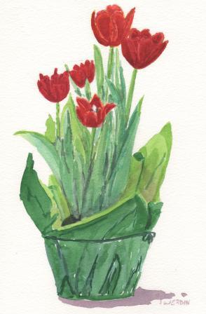
A Pot of Spring


Spring Tulips, Watercolor, 7 1/2 x 11

I saw this pot of tulips at the grocery store and they were too tempting to resist. What a wonderful reminder that spring is coming. We don't grow tulips in southern Florida, it just doesn't get cold enough for the bulbs. But, we can enjoy the potted tulips that are available every spring. I like them better than the cut ones because they last long enough for me to get around to painting them. If you want them to last you have to buy them with the buds still hidden in the leaves and have faith that they will spring up to be lovely blooms. Only one was blooming when I bought them but a couple of days later I have five flowers and the first flower is already beginning to close. It seems a short window of opportunity but so worth it.

Tuesday, February 01, 2011

Experimenting With Bright, Bold Backgrounds


I've found some old paintings to experiment with. I'm putting bright, bold backgrounds in to see if it's a good way to perk up a dull painting. All of them had rather wimpy backgrounds before but I didn't think to take a "before' picture. The poinsettia had an especially pale blue background and I think the bright background has really perked it up. These paintings are small but I think the bright backgrounds is an effective way to call some attention to them.

Sunday, January 23, 2011

A Few Adjustments


Iris, 15x22
I made a few adjustment to the Iris painting. I toned down the dark streak on the left side and the stenciling in the corners. I used a watersoluble Neocolor II by Caran d'arche. These are like opaque crayons that are watersoluble and work well to mute areas that need adjusting. I used a white and pale pink and smeared them with a damp brush. I made some highlights in other areas in the same way but they are hard to distinguish on this small photo. I also added some collage calligraphy and a butterfly on the right to repeat the bright pink on the left. The changes are subtle but I'm happy with the results.

Saturday, January 22, 2011

Three Paintings In Three Days

Poppies 11x11Iris 15x22Calla Lilies 15x15


I have been a very busy painter this week. I had a three day workshop with Karlyn Holman. You have to be a fast painter to keep up with her program. She has lots of ideas and the learning is on a pretty steep curve. To make things move along quickly she provides the drawing so that you can get to the fun part of painting and collage. Everyone had their choice of flower subject but the process was the same in each lesson. The Calla Lilly lesson was to paint an interesting background with different width of vertical stripes while still having a dominant color direct the eye through the painting. In this case it was the red. After the background was in the subject was painted.
The second painting was the Iris. The background was also painted first in bright colors with collage papers added to the wet paint. Some stenciling was done while the paper was wet. The stencil was placed on the paper and watercolor pencil was sanded over it to create the colored area. After drying the collage papers were glued and allowed to dry again. Then the rectangle behind the iris was drawn and painted. When this was dry the iris were painted alternating light and dark.
The third painting was the Poppy painting. The object of this lesson was to create a path of light behind the subject. You made a plan of how you wanted to accomplish this and then you followed the same steps as the previous paintings; paint, collage papers, stenciling, drying, gluing, then painting the subject. It's fun to come home from a workshop with 3 paintings that are mostly completed. Now that I'm looking at them after a couple of days I can see some areas where I could adjust some of the colors. With watercolors it's amazing what you can correct, but that's a secret. Most people think you can't correct watercolors so "shhhhh" it just between us.

Thursday, January 13, 2011

Blue bird


This is the second little bird I did with the "Burridge method". I put the watercolor on first and the acrylic after it was dry. I've done quite a few since I started this technique and they aren't photographed yet. I've had more fun cutting up old watercolors and slapping on acrylic paint. It feels awfully good to have those paintings that didn't quite work all covered up. I even tackled some old canvas boards. There is something freeing about playing with materials that aren't pristine. You don't get that, "white paper, now what do I do?" feeling. I keep looking at a sentence out of the book Art and Fear by Bayles and Orland that I have posted over my desk, "The function of the majority of your artwork is to simply train you how to make the small portion that soars." That's what I'm doing, I'm in training.

Monday, January 10, 2011

Colorful Bird


One of my last posts I resolved to paint at least 10 minutes a day. Then a sudden death in the family changed that plan. The first week of the year changed our lives and our plans. But, we know that God is in control and we can trust Him completely with our lives and our loved ones.

Needless to say, I've been in a bit of a funk and not in the state of mind to paint. Then, thanks to Nancy at Adventures With Paint I learned of the web site for Robert Burridge, www.robertburridge.com . He is so enthusiastic about painting and shows such a simple way of making something out of nothing that I just had to try it. I threw some watercolor paint on some small pieces of paper and let it dry overnight then I painted with acrylic the negative space around a bird shape. There will be more of these to come, they are way too much fun. Give it a try.

Saturday, January 01, 2011

A Nightingale Sang

A Nightingale Sang 15x15 Acrylic Collage

Happy New Year to all! I finally got my last finished painting photographed and ready to place on my blog. It's another acrylic collage that sort of evolved. I have one thing planned and then it keeps getting modified and rethought until I like it and decide it's finished (for now). The bird that is collaged into the painting is probably not a nightingale but the painting made me think of the song. In the lyrics there is a reference to the moon so I thought it fit. It was fun putting it all together and getting the colors to where I wanted them.

I went back in my blogging history and discovered that the anniversary of starting my blog had passed without comment. I found that I started on December 11, 2008! Wow, how time flies. I may have to do a painting with "tempest fugit" to commemorate the event.

I don't usually make resolutions anymore; life seems to interfere with resolutions. But, be it resolved: I will paint at least 10 minutes every day! Surely 10 minutes is achievable!


Sunday, December 26, 2010

Holidays

I hope all of you had a Merry Christmas! Ours was a wonderful family gathering in Arizona at our son's house. There has been no painting, not even a wet brush! I'll try to get back to it soon, I miss my brush and paint time.
A special thanks to all who have commented on my paintings over the year. It really means a lot to me to have your feedback.

Saturday, December 04, 2010

Second Day Workshop Painting

White Pelicans, watercolor, 15X15
This was the painting we did the second day using the color mingling techniques we learned on the first day. The subject was more complicated, especially the water which was quite a challenge. I ended up cropping the right side of the painting which was just more water since I had eliminated the far right pelican on the original. It was a wonderful subject to paint and I really appreciate the great reference photos that Ann Abgott allowed us to use for our paintings. I thought it would be fun to paint some swans that I had photographed and when I looked at my pictures, I didn't have the wonderful shadows on them like these pelicans had. So much of reference photography is being at the right place at the right time. I also set up some still life scenes to photograph and found out how tricky that is as well. Light source and shadows make all the difference.

Friday, November 26, 2010

Workshop, Third Day


Bowl of Cherries 15x11
I haven't finished the painting for the second day so I'm skipping to the third day painting which I just completed. I've always looked at crystal bowl paintings as just too detailed for me but once I got into it I must admit, I got hooked. It's amazing that just with leaving white in the right places you give the illusion of sparkling glass. I think I may have to try this again with my own set up.
The background was done the same way as in the previous pear painting except that this time I used silver gesso to stamp on the background with added dark greens. I think I would be less heavy handed with the silver next time around.
A special thanks goes to Anne Abgott who was so generous with her time and supplies during our workshop. You can find her at http://www.anneabgott.com

Tuesday, November 23, 2010

Second Workshop Painting

Two Pears 7 1/2" x 11"
In this painting we used what we learned about mingling colors. The pears were painted first using a yellow as the first color and then adding the appropriate colors while still wet. As long as the paper is wet you can add and blend the colors until you get what you want. The blemishes on the pears were added last with thick paint while there was still some dampness. Since the paint was applied without much water it didn't make a back-run or blossom. That was really a revelation to me. The back ground was made by stamping gold acrylic gesso liberally with a rubber stamp. After this was dry, we applied fairly thick paint the consistency of heavy cream in alternating shades of red and mineral violet for the really dark. These mingled together and I think made a really nice effect. When that was dry we could go back with a slightly damp paper towel and rub over the gold to reveal it's shine. We also added the shadows of the pears.

Sunday, November 21, 2010

Workshop with Ann Abgott


Our first lesson with Ann Abgott was to learn her method for putting down color. She prefers to mingle her colors on the paper instead of premixing them in the palette. This gives a very nice, lively affect especially with shadow shapes as this painting shows. We worked on 300# Arches paper with wet puddles of paint which, when applied to the paper mingled in quite a beautiful way. I could go into this painting and darken the shadows and define the man and bench more clearly but since this was an exercise in mingling the colors I think I shall leave it as it is. I think I will incorporate this technique into my paintings from now on. More of what we did in the workshop will follow later. Wouldn't it be fun to paint a turkey this way?

Sunday, November 14, 2010

Fun With Mixed Media


Heart of Gold, Mixed Media/Collage, 22x15
I have worked on this piece for quite a long time. I'd put it away for awhile and then get it out and work on it some more. I don't know how many times I've added and subtracted from it. It was always a little distraction in the back of my mind and studio. I think we should call these distracts instead of abstracts. It has a lot of texture in it with stringy papers, lumpy papers, printed papers and a little 3-D paint; things that I love to play with. I have to be careful to not fill it up with too much, it's far to easy to do. I found the words from a song that seemed to go with it since I found some hearts in it which I painted with gold paint. These paintings are always learning tools for me; building blocks for future paintings.

Thursday, November 11, 2010

Ipanima

Ipanima, watercolor and ink

The mention of Ipanima just conjures up such thoughts of a lovely beach with lovely ladies looking "straight ahead, not at me". I painted this for the Virtual Paint Out this month which is in Rio De Janero, Brazil. It took a little hunting for me to find Ipanima and what a charming looking place it is. All along the street side there are these cute refreshment stands with tables and umbrellas for their customers. I liked this one because of the coconuts piled in front of the stand. Are they serving rum drinks out of the coconut shells, or are they just selling the coconut milk and flesh?
Way down on the waters edge are the lines of beach umbrellas and sunbathers. It looks like quite a walk on the sand to get there, but no matter. From the pictures that I saw along the beach there is quite a crowd, not unlike the crowd you'll see here on the beaches in Florida during spring break. There's just something about a beach and water that is so inviting.

Sunday, October 31, 2010

Purple Artichokes

Purple Artichokes 15x22, framed to 22x28

So, it's finally declared finished! I don't think I've ever procrastinated as long on any painting as I have on this one. I have signed it and framed it so I will have to stop puttering with it. The photo doesn't show the greens off very well, but it's pretty close with everything else.

Perhaps now that I'm at home in my little home studio I will be more regular with painting and posting. It seems like the summers in Minnesota throw me off the painting schedule. I find it difficult to paint consistently when there is a lot of activity going on around me. Does everyone have that problem? Has anyone found a way to shut out the activities around you and still paint? What works for you?


Thursday, October 21, 2010

Blue Heron on Green Pond


I'm back in Florida painting Florida pictures. I guess a blue heron can be found just about anywhere in the summer, though. This is a little 3.5" x 5" acrylic on canvas painting that will be a donation to our local art league for fund raising. I enjoy painting these birds very much, as you can tell by the number of them that I have posted.
I've been getting settled, again, and getting the cupboards and refrigerator stocked. Then there's the appointments with doctors and dentists that have to be taken care of. Finally I can settle down and get some painting done. I've enjoyed reading the blogs the past couple of weeks and I've been itching to do a Virtual Paint Out or a Twenty Minute Challenge; I hope I get in the groove to do one or both of those before the month is out.

Tuesday, September 28, 2010

Autumn


We have a beautiful maple tree in our backyard and it's leaves are turning the most wonderful shades of autumn. There is no way to paint that kind of color but I had to try before leaving for the winter. It's interesting that the leaves change first on the south side and top of the tree while the north side remains green. This will probably be my last post until I'm up and running in Florida again. I couldn't leave without painting a fall scene.

Followers