Tuesday, June 28, 2011

I painted something!


I know, it's not my usual painting format, but I finally had a brush in my hand. Ever since coming to Minnesota for the summer I've had one excuse or another for not starting a painting. This excuse was a class in making concrete leaf shaped table tops which I attended with a friend. The wet concrete was pressed onto a rhubarb leaf and allowed to dry overnight. After the leaf was removed the concrete was painted by my friend and me. I had a brush in my hand and it felt good! So, today I got my paints out and wet, I'm ready to go. I hope I soon have something else to show you.

Wednesday, May 18, 2011

Granddog


                                                 Klyde-watercolor

I've been trying to paint Klyde for several months. I'll work on him a little and then go on to something else. He showed up again during my annual organizing of art things to take on the trek up north for the summer. I think I need some more practice with painting animals, it's not something I do very often. There's a trick to getting the fur to look furry, and the expression to be just right. I'll get a chance to try another picture this summer because he's my "granddog" and he will be visiting. The fun thing about dachshunds is that they stay puppy-like for a long time. I've always enjoyed their unique personality. It will be awhile before I can post again, but I hope to do some little paintings on our travels and have something to post when we are set up.
I'll be back on blogger in a couple of weeks.

Thursday, May 12, 2011

Coneflower with Butterfly

                             Coneflower With Butterfly, 2x4, W/C pencil

By making small paintings with my watercolor pencil I can fullfill my obligations to my various art leagues for the miniature donations each year. It's such good practice for a new medium. It seems that most artists that use the pencils tend to keep the works small, under 8X10. I'm still finding it difficult adding darks after the initial layers have been put down. I find that the under layers seem to get picked up if I try to add wet pigment to the top.  I may try to mix regular watercolor with the pencils for an expanded range of values. I think I will enjoy using the pencils when I travel because of the need to simplify my what I carry. There's no need to worry about liquids when you carry pencils.

Saturday, May 07, 2011

Mangos II

                                   Mangos II, 3x5, watercolor pencil

This time I used a smooth paper, Vellum Bristol paper, to work on. I liked it better than the cold press I used for the last picture. It was easier to get a smooth look and to diminish the look of the pencil strokes. I decided to paint fewer leaves; I felt they cluttered the background and detracted from the simple mango shapes. I also left the background white which for this small format is OK. On a larger composition I would probably have added one.
I'm starting to get the hang of how much pigment to use and how to layer the colors for the effect that I want. I'm finding that after a few layers, the paper seems to be "full" and it's difficult to add anymore pigment unless it is added with a wet brush. That's something  that pastelists complain about, paper without enough "tooth". I think trying different papers and materials is consistent with any medium that one chooses to work with. It's what makes the whole process enjoyable.

Thursday, May 05, 2011

Watercolor Pencil learning curve

                         Sun Dappled Mangos 4x6 watercolor pencil


This is my first attempt at a whole picture using watercolor pencils. It's an experiment, I haven't really learned the way to proceed with the pencils. So it's pretty much trial and error. The top mango blended much better than the bottom one. I tried burnishing the bottom mango before using a wet brush. Burnishing bruises the paper and makes it difficult to blend the colors with water. So, that was lesson #1. I haven't quite got the hang of how to get soft edges, I'm hoping to figure that out. I've got to wait until Monday for my next class. I think I could have painted this in less than half the time with just watercolors and a brush, and I found myself just taking the pigment off the pencil with the brush and applying it to the paper.

Wednesday, May 04, 2011

Watercolor pencils

                             Exercise #1, watercolor pencils

I'm taking a class in watercolor pencils. Although I've had them for many years I've only used them slightly. I thought this class would give me some ideas for how they can be used effectively in my art work. We spent most of the class time making color charts with the pencils that we had, diluting them with water, and basically just seeing how they work. The homework assignment was to make spheres in squares. The primary colored spheres with the complimentary color as the background square and the shadow a combination of the two. All of these were finished by wetting with a brush. They are really much more versatile than I thought they would be.

Sunday, May 01, 2011

Quick Geraniums

                      Quick Geraniums 5.5X7, watercolor on gesso paper.


I've been frustrated lately with the paintings I've been working on. It seems like they just aren't coming out the way that I'd hoped they would. Sometimes I just have to put the big stuff aside and do something small and quick. This afternoon I brought a geranium pot into my studio and painted it on a little piece of paper that had been textured with the "gesso juice". The painting looks like more pot that flower but you should have seen that poor little geranium before it got some TLC and fertilizer! Doing paintings like these puts the joy back into painting for me. I was about to change my name to "strugglingartist" instead of "joyfulartist".

Saturday, April 23, 2011

Nasturtium II


                                              Nasturtium II, 7x7 Watercolor


This is the second nasturtium study I did last week. This week I worked on a larger painting of nasturtiums since my friend brought in more flowers. It seems like there's a loss of "freshness" with each subsequent painting. Why is that? Wouldn't you think that the more you do the better you'd get at it? Perhaps the trick is to keep changing the view or the light the way that Monet painted the haystacks. I would be interested to know if other artists paint the same subject but change something about it.

I hope all my fellow bloggers and blog readers have a very blessed Easter!

Sunday, April 17, 2011

Quick Nasturtiums

                                       Nasturtiums, watercolor, 7x7

A fellow artist brought a little vase of nasturtiums from her garden for a still life painting. I decided to join her in painting them. I set up a larger painting and while I was waiting for the background to dry I did a couple of quick paintings for practice and to get the feel of the flowers. This is the first of the two paintings and I think the better of the two. I did it in three stages, the initial loose laying in of color and form with no drawing first, after that dried I added some darker areas in the flowers. Lastly a few shadows. I didn't want to loose the freshness by getting too detailed. It's always interesting to me that these little warm ups, or less serious paintings turn out to be so pleasing. I need to do more of these small quick paintings, I really enjoy them.

Monday, April 04, 2011

Paris

Paris, watercolor photo, 5x7


I did another watercolor photograph. This time from my favorite foreign city, Paris. It was printed on watercolor paper in black and white and then painted. The trees came out so dark that it was difficult to get them to look green like they did in the colored photo but it still has that antique postcard look that I really like. Except for the modern cars and dress of the tourists it could almost pass for one. This is fun and quick, almost instant gratification except for the hours it takes me to look through my photos, choose and edit one for painting. The painting part is always the fun part.

Saturday, April 02, 2011

Watercolored Photo

Victoria and Albert Museum Courtyard, mixed media, 12x12


I found this idea in the July/August 2010 issue of Sommerset Studio magazine. The article was by Angela Cartwright. She explained how she printed black and white photos on watercolor paper, painted them with watercolors and then mounted them on canvas boards or wrapped canvas. I thought they looked interesting to do, so I set about trying it. I found a picture I had taken on a trip to London. It's from the courtyard of the Victoria and Albert Museum. I didn't have the watercolor paper that is manufactured for printing in a home printer but I did have some Aquarius II, 80#, by Strathmore. I cut it the size of printer paper and printed out my black and white photo. Painting it was a dream because the Aquarius paper doesn't buckle or pucker from water, the photo already had the dark and light areas. Once painted it reminded me of old postcards before color film. The canvas was prepared by painting it lightly with green/gold acrylic and then wiping on a cream white after it was dry. When that was dry I attached the picture to the canvas with matte medium, coating under and on top of the picture being sure that all the edges were secure. The next day I decided a little gold paint rubbed in a random way around the painting would be fun to try. I will probably coat the whole thing again with a UV protective varnish.
I've tried to add a link to Angela's web site. I hope it works. www.acartwrightstudio.com/alteredparadox.htm.

Friday, March 25, 2011

Yellow Crested Night Heron

Yellow Crested Night Heron, watercolor on acrylic, 11x15

This handsome fellow hangs out near the gallery where I was painting. He was trying his best to convince his "lady" that he was really the one she should choose. He shows his long yellow crest feathers and brings twigs and sticks for a nest. He looked quite sincere. They flew away before we found out what the ending to the courtship would be. They are very striking in appearance, with their black heads and white spot and yellow crest. I painted it on one of my watercolor papers that had been coated with the gesso juice and then had a pale olive green wash on top of that. The dark green background is supposed to hint at the denseness of the mangroves they like to sit in.

Tuesday, March 22, 2011

Sea Grape Leaves II

Sea Grape Leaves II, 11x15, Mixed Media

So I had to go and do some adjustments after looking at this painting on the easel for awhile. I decided I wanted a little bit of the yellow on the right side and to add some shadows to make the leaves look more individual. Working on paper that has gesso on it is similar to working on Yupo. What watercolor is on the paper can be lifted so easily if you try to paint something on top of it. Even with paint on your brush it tends to go to the white of the paper instead of putting color down. It's a learning curve for sure. The advantage is that if I don't like the changes, I can try to take them out and replace the original color. But, you still have to problem of taking it down to the white of the paper. The whole thing is an experiment at this point. Do you think it worked?

Sunday, March 20, 2011

My Time at the Gallery


Sea Grape Leaves 11x15 Watercolor over gesso-paper with collage.
This is one of my favorite subjects to paint. I love the way the Sea Grape leaves become such a range of colors from dark green to orange, yellow and red. I painted this while at an outdoor set up at the Wildchild Gallery in Matlacha Florida. We had pretty nice weather, the temperature was in the low 80's F. About 28 C. There was a nice breeze most of the time and very bright sunshine. The 7 artists all had big umbrellas for shade so we were quite comfortable.
This paper had a coat of the gesso juice that I mentioned in an earlier blog. It seemed to work well with the subject since it also had a layer of multi color watercolor as an under painting. I put a little bit of calligraphy collage in a few places just to add a little mystery to the painting. I had nice comments by folks who were visiting the gallery about the paintings I had on display which makes it all worth while.

Tuesday, March 15, 2011

I'm Still Here

Passages, Abstract 1, 11x 15 watercolor

I'm still here, I'm still painting but it seems like I'm not finishing things, just starting things. This abstract was started in Kathleen Conover's workshop but, of course, I've had to fiddle it to death. Abstracts are like that for me; I'm never quite sure when I've finished. I think I've got this painting where I want it after adding and subtracting for the last two weeks.

I had a demonstration week end at the Wildchild Gallery so I painted for two days straight and have nothing to show for it. It's hard, no, impossible, to keep your concentration when you are having to interact with people who come by. One is expected to "schmooze", I'm not too good at that but I try. It's fun to meet and talk with people but I can't make any art that is worth the name while I'm doing it. I have another such week end coming up this Friday and Saturday. So, if anyone has any ideas of how they paint and converse I'd like to hear how they do it. Sometimes I paint on yupo because I can wipe it off and start over and not feel like I'm wasting too much. I can do the same with paper that has gesso on it and that is something that is interesting to the people who come by and only know traditional watercolor.


Sunday, March 06, 2011

Mixed Media Heron


Mixed Media Heron 11x15
I'm finally back to posting. Not only was my bout with the crud long, I had a 4 day workshop in the middle of it. I didn't want to forfeit my payment for it so I dragged myself into the studio and did what I could. There was a day of sort of messing around with acrylics on fresh paper and old paintings. We learned different ways of getting a variety of textures on the paper which would be our under painting. After that there was a lot of emphasis on composition and design. It seems like that has to be drilled into my head on a regular basis because I get these neat under paintings and then I don't know how to develop them into art that really works. I think I work more intuitively but that is so unreliable. I'd like to be able to make a plan and stick to it. Anyway, this heron painting was one of the paintings that came out of the four days. This was done over an old painting and coat of "gesso juice" (1 part liquid gesso, 1 part matte medium, and 2 parts water), textured with a plastic card. The dark blue background is thick watercolor, the heron is gesso juice and watercolor. The workshop instructor was Kathleen Conover. www.kathleenconover.com Look her up, she does very interesting work and I found her to be a wonderful teacher.

Wednesday, February 16, 2011

When Life Gives You Lemons


When Life Gives You Lemons, 11.5x15, watercolor.
This is another still life that I set up and photographed. I love blue and yellow together and I thought this might be a challenging subject to paint. I was right on that! I don't know how the lemon drop jar got a little lopsided but it did. Except for that I like the results. It was done with the same techniques that I learned doing the cherry paintings. The colors are blended on the paper which is 300 lb. cold press. I finished this painting several weeks ago and wasn't going to post it because of the slightly tipsy results but since I have the "crud" that has been going around it sort of describes how I feel; a little tipsy and full of lemons (I drink a lot of hot honey and lemon water). I admire people who can paint when they don't feel well, unfortunately I'm not one of them. I'll know I'm getting better when I feel like picking up the paint brush again.

Wednesday, February 09, 2011

More Cherries

Cherries and Crystal 11x15 watercolor and acrylic
I had to paint some more cherries in a crystal bowl after learning the technique from Ann Abgott last month. I set up my own still life and photographed it from different angles to try to get a good composition. I assumed this is easy when I started, but I soon find out that it's not! After a lot of trail and error I came up with a photo that I liked and printed it out. Then it was off to the printer to get an enlargement to work from. I did several set ups so that I wouldn't have to keep making trips. I have worked on this over 3 or 4 weeks with a Karlyn Holman workshop in between. I find it really helps to do your own painting after learning something new; it helps those newly formed brain cells to stay in place. Now I'm thinking of combining the two different styles of painting. "I wonder what would happen if..." is one of my favorite questions.

Monday, February 07, 2011

A Pot of Spring


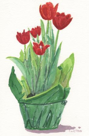
Spring Tulips, Watercolor, 7 1/2 x 11

I saw this pot of tulips at the grocery store and they were too tempting to resist. What a wonderful reminder that spring is coming. We don't grow tulips in southern Florida, it just doesn't get cold enough for the bulbs. But, we can enjoy the potted tulips that are available every spring. I like them better than the cut ones because they last long enough for me to get around to painting them. If you want them to last you have to buy them with the buds still hidden in the leaves and have faith that they will spring up to be lovely blooms. Only one was blooming when I bought them but a couple of days later I have five flowers and the first flower is already beginning to close. It seems a short window of opportunity but so worth it.

Tuesday, February 01, 2011

Experimenting With Bright, Bold Backgrounds


I've found some old paintings to experiment with. I'm putting bright, bold backgrounds in to see if it's a good way to perk up a dull painting. All of them had rather wimpy backgrounds before but I didn't think to take a "before' picture. The poinsettia had an especially pale blue background and I think the bright background has really perked it up. These paintings are small but I think the bright backgrounds is an effective way to call some attention to them.

Followers