HAPPY NEW YEAR!
30 paintings in 30 days starts January 1.
Happy painting everybody.

The function of the overwhelming majority of your artwork is to simply train you how to make the small portion that soars. Art and Fear, page 5, David Bayles and Ted Orland
Tuesday, December 31, 2013
Saturday, December 21, 2013
Almost Christmas!
.jpg)
Christmas Painting for 2013
5X7 Watercolor
At our house, we celebrate Jesus' birthday on December 25th. I know that his real birthday is not known for sure, but going with hundreds of years of tradition is OK with me. We have some eye witness accounts of his birthday, though, and it's pretty incredible. Angels appeared in the sky and sang! Not to the upper class people of the day but the lowest on the list, the shepherds. Then they went to see the baby in a cow shed and spread the news to all their friends and neighbors. I guess God wanted us to know that He came for everybody, not just the big shots of the day. That's a wonderful thing and worth celebrating. May your Christmas be blessed!
Friday, November 22, 2013
Three Little Abstracts

Abstract Collage Sunset

Abstract Collage With Face and R

Abstract Collage With Face
These abstracts are only 3.5 X 4.5 to fit in a 5 X 7 mat and frame. They are all made without regular adhesives and are pressed together with a heat sealing iron. I love being able to lay out my collage and move the papers around, then, when I've decided it's just the way I want it, I heat up the iron and press it together. The next step is to rub a little compatible acrylic color over it with a baby wipe. This gives it a thin coat that unifies the piece. Almost all the papers are altered or colored by hand so I can always find the colors that I like to work with because I've made them myself.
I've also been taking a class in painting abstracts in acrylics. If I get a "good one" I'll post it too.
Monday, November 11, 2013
Assembled Collages
.JPG)
Collage 3
.JPG)
Collage 8
These are my first collages assembled from some of the papers I prepared a few weeks ago. The papers are selected using the colors you want to work with. Then they are torn, cut and arranged, until you are satisfied with the composition. Because they are coated on both sides with gloss medium you don't have to remove them to glue them down. You simply carefully cover with release paper and iron them down with a 350 degree iron. I wasn't satisfied with the first layer so I added a few more papers to complete the collage. Then I ironed again. To unify the collage I rubbed a little acrylic paint in a compatible color using a baby wipe to control the layer of paint and keep it thin in some places. At the very end I decided to stamp the numbers on them. I plan to post one on Artists in Blogland Scavenger Hunt. The theme this month is numbers.
Wednesday, October 30, 2013
Syntagna (Arrangement)

Syntagna
Mixed Media, 22 X 28, framed
I found this word and saved it for a painting title. It's definition is, "A juxtaposition of forms that relate to but are different from one another". I thought it was a perfect title for an abstract painting. This has several pieces of collage on it including some clown faces in a row next to the vertical blue stripe on the top left. That's making me think that maybe I should title it "Send in the Clowns". Thinking up painting titles can be such a chore sometimes, no wonder some are just titled "Opus 5 or 32", it would be so much easier to keep track that way. I hope you click on the picture so that you can see all the texture and layers that are in this piece. There is a lot to look at. I'd love to hear some comments concerning the title choices, what do you think?
Saturday, October 26, 2013
More Papers

String paper

Unuyru paper

Lace paper

Tissue paper
I made 4 more types of papers on Friday. The string paper was made by laying pieces of string in a grid fashion across tissue paper, then lay another piece of tissue on top, then coating it with a mix of liquid acrylic paint, gloss medium and water.
The unuyru, lace and tissue papers are simply coated with the same mixture in whatever colors are desired. I made several different colors of all the different papers. It's good to have a good supply of colors, shades, textures and papers before you begin to build your collage. The papers are laid on white plastic garbage bags and then hung up to dry with clip hangars. After drying they can be embellished using stamps, stencils, or freehand.
When dried they can easily be stored in color groupings on the hangars in a closet for easy access.
I can't wait for the next step of designing the collage without adhesives.
Thursday, October 24, 2013
Making Collage papers, Step 1

Altered magazine pages for collage
I've been occupied lately with making papers for collage without adhesives. It involves a lot of preparation ahead of time. These are pages from National Geographic Magazine that have been altered. The ones on the upper left have been stamped with gloss medium, allowed to dry and then the ink on the picture has been removed with a metal cleaner called Never Dull. Only the ink under the stamping has been preserved. The papers on the right were altered with the Never Dull with stencils or other texturing devices.
The next step is to coat these papers on both sides with gloss medium. You may be asking why go through this process? Because these papers are now uniquely mine. They are not copies of anyone else's photos or work. My finished collage will be all original. I forgot to mention that these collages will not need adhesives. More on that next time!
Tuesday, October 08, 2013
Eve's Garden, Revisited

Eve's Garden
Watercolor, 15 X 22
Have you ever framed and even shown a painting and then, while it's hanging on the studio wall you see something about the painting that bothers you? There was just something about this painting that was bugging me until I took it out of the frame and redid it. It was the way that the elbows of the figure pointed out of the picture. They seem to direct the eye away instead of into and around. So, using a little Magic Eraser I carefully wiped away the pointy elbows, allowed the paper to dry and then went in with some paint to make some flower shapes. There was also a spot on the right side that seemed too light so I added some paint to that. Now I think the yellow on the left is too bright on the edges and may need some toning down. Stay tuned for more updates!
Tuesday, October 01, 2013
Sea Grapes on Aqua Board

Watercolor and gouache 11X14
September 20-22 was the annual Florida Watercolor Society Convention in Sarasota. I drove up with friends and enjoyed two days of watercolor demos and trade show. One of the demos was by Theresa Kirk who painted on Ampersand clay board. I have had two pieces of this product since last year's convention and thought I'd better see how she used it. First she put down random colorful marks in watercolor. Then she started making her painting over the marks. I know she used gouache in part of the process but I wasn't sure if she started her over painting with watercolor or gouache. No matter, I went ahead with gouache and as a result I covered most of the under painting. You can see a little of it under the lighter leaves. If I decide to keep this painting I will spray it with Krylon fixative and then coat it with an acrylic varnish. I think I will probably try to remove this painting and do something else just because I want to see how that works. You can find examples of Theresa's paintings at www.TeresaKirk.com The FWS convention was great; a wonderful group of artists, demos and products all in one place.
Thursday, September 26, 2013
Painting on Yupo

Henny Penny 2
Watercolor on Yupo
I enjoyed painting the first chicken so much I decided to do a second one on a piece of Yupo that was in the latest issue of Watercolor magazine. With it was an invitation to post your painting on their facebook page. I did that and also posted it on my facebook page which is Jan Werdin Art. Since the watercolor lays on top of the paper instead of soaking into it one has to exercise extreme patience so that all your colors don't run into each other. The advantage is that the colors remain true and bright. If you allow each color to dry, at least on the edges, you can get the paint to cooperate. It's a fun surface to paint and play on, if you don't like what you've painted you can put it in the sink and wash the whole thing off. I recommend that you give it a try if you have never used it. It has a whole range of possibilities.
Tuesday, September 17, 2013
A Little Red Hen

Henny Penny
9x12 watercolor
Last week in the Open Painting group I chose to paint a chicken from a photo that I had. She looks quite smart and sure of herself and reminds me of the children's story The Little Red Hen. I think her name was Henny Penny and no one in the barnyard wanted to help her make bread but everyone wanted to eat it when she was finished; but she wouldn't let them. The moral being that if you don't work you don't eat. I wonder if that tale is still being read to children today.
I painted her feathers with quinacridone orange, burnt sienna, and a mixture of ultra marine blue and green blue. When it was dry I added some iridescent orange and blue. It adds a little sheen to the painting which doesn't show up too well on the photo.
Sunday, September 08, 2013
Cabin In Maine

Cabin In Maine
Watercolor 5X7
I haven't had much time to paint lately. We have been traveling again. This time to the other end of the country on the west coast. But I had my photos of Maine with me so I painted this little painting of a charming rental cabin near the water. I saw buoys all over the place; the people in Maine seem to like to decorate inside and out with them. I can see why, they are colorful and have interesting shapes. Some of them are weathered and well used. This little cabin was with a group of cabins all quite small. It reminds me of another era; one without high rises, chain hotels and condos. Just a simple cabin, fresh air, the sea and sunshine.
Monday, August 19, 2013

Homeport Watercolor, 7.5 X 11
I painted the view of our friend's cabin in Maine as seen looking up at it from the dock. I loved all the lovely windows that bring in the light all day and allow a fantastic view of the lake. The area on the right is a screened in porch with screens on 3 sides. It is surrounded by thick woods so that you feel isolated even though there are other cabins quite close on either side. There is an easy slopping, winding path to the water around mossy rocks and low vegetation.
The treat for me when I'm at a place like this is to go down to the dock when it's dark and look up at the star filled sky. Our cities have so much light at night that we are deprived of seeing the vastness of the sky at night and the unfathomable number of stars in our galaxy. It brings to mind the question the Psalmist wrote in Psalm 8:3 and 4, (my own paraphrase) "When I look at the moon and all the stars that You made I think, Who am I that You would be thinking of me, and care so much for me?" It's good to have perspective!
Wednesday, August 14, 2013

Two Pots for Potts, Watecolor
We had a wonderful week with our friends in Maine last week. The weather went from cloudy to pouring down rain and then glorious sunshine. I had a chance to use my little travel painting kit and paint a quick picture of my friend's flowers that were on her table. It's been awhile since I've done just a simple watercolor and it was so fun and relaxing. She was delighted to have it as a reminder of our visit. I have some more ideas for painting scenes from Maine so keep checking in on me.
Saturday, August 03, 2013

Beach Palm, 22 X 28 Acrylic
The last couple of weeks I've been working on a painting for a friend. She wanted a beach painting large enough to cover an electrical box. It was a challenging assignment for me since I am a watercolor painter. My venturing into acrylics has been sporadic and mostly abstracts and folksy things. A person who does watercolors has to switch gears and paint from dark to light instead of saving the lights and adding dark colors at the end. Learning how to get soft edges is hard to achieve in acrylic and one of the things I love about watercolor. Another challenge was painting a landscape in the portrait format in order to cover the electrical box. In the end, I'm satisfied with the outcome and hope my friend likes it. Sometime in the future, if I get brave, I may add a bird. Would you?
Monday, July 22, 2013
Butterfly Scarf

Who knew that my first project after some vacation and travel time would be a silk scarf? I didn't. But, a friend wanted to paint one and thought it would be fun if we painted our scarves together. I decided to leave my scarf white and paint colorful fantasy butterflies on it. I didn't want to get stuck with painting realistic butterflies and decided to make them as many colors as I could. I also wanted to try some new materials. We had some fabric pens to experiment with that were in shades of yellow to orange, a fine black pen and a glitter pen.

Close up
On this close up you can see where I used the glitter pen on the circles and a little on the body. I outlined all the butterflies with the fine black pen. This was an interesting, fun project and it got me into painting again. I'm starting a beach painting for a friend.
Wednesday, July 10, 2013
Bottle Tree

I've been traveling the last month to see family and friends. While staying in Minnesota with my friend Pam we made a bottle tree together. She had been saving blue wine bottles for at least a year and had her husband set a post in cement. We drilled starter holes and pounded in spikes to hold the bottles until we ran out of spikes. It's quite a nice accent of color in her garden and I can't wait to see it when she is finished. She'll have to finish without me, though, since we arrived back home yesterday. I took along my watercolors and a new mixed media book but they came home with me unused. Oh well, I'll be back in the creative swing of things and posting again soon.
Monday, June 17, 2013
I Can't Stop Now

His Eye Is On the Sparrow
Heat set collage 8 X 10
I know I said I was going to go back to painting but a friend sent me an email about the heat set collage she was doing. I went to a couple of web sites and read a little bit about it and was hooked. I had to order a book, iron and release paper so that I could try it. After my order came I spent Saturday and Sunday coating a bunch of papers and substrates with gloss medium. I had to try one today because tomorrow will be my packing day since we are going away on Wednesday. I just wanted to try putting something together without too much angst about composition and design. After tacking down most of it I added a few bits and pieces to soften the hard edges and break up the upper left corner. The fun thing is that once you lay down your design you don't have to remove it and add glue. You just cover it with the release paper and tack it down with the hot iron. The down side is preparing all the papers ahead of time by coating it on both sides with gloss medium. Now that I have a lot of papers coated, I should be able to do quite a few when I get back.
Sunday, June 02, 2013
The Final Collages
.jpg)
Looking Askance
4 X 6 Collage on mat board
I'm coming to the end of my collage making. It's time to move on to other things and get out some paint. On this collage I used an image transfer for the lady, and a mix of manufactured papers, napkins and papers that I have painted and stamped.
.jpg)
Bluebird Song
4 X 6 Collage on mat board
This is one of my favorites. I love the bluebird I found on a new napkin, the stringy stuff on the lower right and the connections that the script makes with the edges. It seems to keep my eye entertained around the composition.
+small+(640x640).jpg)
Happy Birthday Cheer
5 X 5 Collage on mat board
Since I am using these images to make note cards I thought I might as well make one with Happy Birthday already on it. Most of the background of this image is hand painted papers with the words, flowers, script and notes from various napkins and papers.

Lucky Streak
4 X 4 collage on mat board
I like this one a lot, as well. I see in it possibilities for a larger composition, which is one of my goals for doing all of these in the first place. It's not just to place images on paper but to place them in a pleasing composition that will stand on it's own. Some were more successful that others and that's what learning is all about.
I'd like to know if my readers have a favorite or two and why. If you have time and will write in my comments box I'd appreciate it. Also, if you are a facebook user I'd love to have you "like" my art page Jan-Werdin-Art
Thursday, May 23, 2013
Still More Collages

Fantasy
4 X 6 Collage on mat board
I started this collage on a dark green mat board and that background influenced the colors of the collage papers that I put on top. I ended up using some opaque papers and paint at the end so that everything wouldn't appear so dark. Lesson learned; put your collage on the white side if you want your translucent papers to show up.
.jpg)
Unexpected
4 X 6 collage on mat board
On this collage I used a combination of manufactured papers and some that I made myself. The leaf is a sticker embellishment, the quote is from a fortune cookie (collagers save everything).
I did some accenting with acrylic dimensional paint and some stamping. Click on the picture to get an enlargement to read the fortune.

Red Bird
4 X 6 Collage on mat board
This little bird keeps showing up. Now he's contemplating why a checker board is under his nest. All of the papers used in this collage are manufactured tissue paper, napkins and art papers.
Like me on facebook: Jan Werdin Art/facebook
Friday, May 17, 2013
A Few More Collages

Eiffel Tower
4 X 6 collage on mat board
I'm still not tired of doing the little collages. This one has pieces that were copied on a ink jet copier. I have found that the Epson ink doesn't smear like other printers do and I've been told it's because theirs is pigment based instead of dye. Some of the papers were stamped, some are pieces of napkin. I added some gold stamping in the top right corner. I like a little shine to my work.

The Golden Egg
4 X 6 collage, with acrylic and ink
This little bird seems to be puzzled but happy about the golden egg. It's another combination of napkin papers and hand painted papers. There is also a little gold acrylic stamping around the edges.

Scrable Rules
4 x 6 collage with acrylic
This collage was done with all manufactured papers. The quote was cut from a magazine ages ago. If you click on the picture you'll be able to read the quote more clearly. This also has the gold stamping on it.
I've been scanning these collages into my computer and designing note cards. I'm very happy with the results. Go to www.facebook.com/janwerdinart and see how you can win a set of note cards.
Monday, May 13, 2013
Collaging

Paris Lady
4 X 6 collage on mat board
The past couple of weeks I've been making little collages on 4 X 6 pieces of mat board. It's been loads of fun and has really sparked my creative juices. I have so many papers stockpiled it's about time I used them. Most of them are papers that I have purchased, and napkins. I also have pictures I have copied on my printer such as the one in this collage and papers that I have painted.

Leaf and Dragonflies
4 X 6 Collage with acrylic
This is one of my favorites, I love using the leaf skeletons and who doesn't like dragonflies? The paper on the bottom is something I colored with watercolor, the top is a commercial paper with threads sewn into it. I used a dimensional gold acrylic to embellish the dragonfly and the top.

Life Is Not Measured
6 x 6 collage with ink and acrylic
I loved this quote that I found on a pack of napkins so I built my collage around it. The olive branch reminds me of the Mount of Olives in Jerusalem and the butterfly is often a symbol of new life, moments that take my breath away.
Tuesday, May 07, 2013
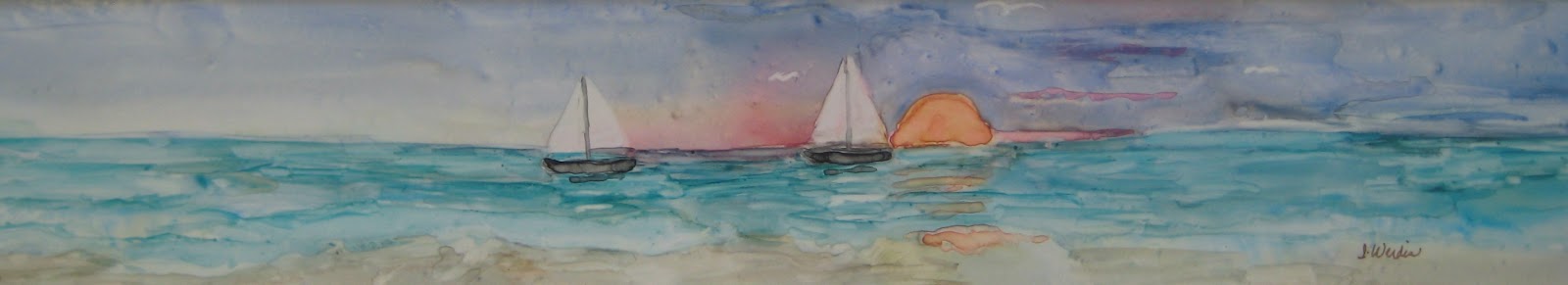
Sunset Sail
Watercolor on Yupo synthetic paper, 20 X 3.5
This is my second entry into the Regatta show. Painting on Yupo is much like painting on the acrylic surface I wrote about in my last blog. I'm able to carve out my white areas with a damp brush. What I find difficult about painting on Yupo is that the paint moves so much before it dries if there is a lot of water in it. So, there is a decision to make; in order to have bright transparent colors I add more water so it's a tea or coffee consistency. But, if I want the pigment to stay put I have to put it on like heavy cream and then it's less transparent. So, I wait for the paint to dry, assess the outcome and, if it needs adjustment, I go in with a damp brush and remove what I don't like and then put in what I think I will like better. Then, the paint does what it wants to do anyway, control is out the window! Never mind. This process is too much fun!
Thursday, April 25, 2013
Regatta 2013

Catching the Wind
Watercolor on acrylic on illustration board, 15 X 20.
It's time again to put forth a painting for our annual Regatta show at Cape Coral Art League. I'm continuing to try to do something experimental with my work. I don't want to do the "same old, same old" but push the boundaries of the conventional rendering of sailboats. I coated my board with gesso and used molding paste for some texture in the bottom third of my painting. This dried completely. Next I put in my blue sky and water background. After that dried I was able to carve out the sail shapes with a damp brush back to the white of the gesso. I continued with the darker boat shapes. I went back into the sails to create the contour with shadows and added people shapes. Finally, I carved out the small sailboat in the distance. This painting went surprisingly quickly because of the gesso underpainting. It allows me to make corrections as I go along simply by wiping out and adding paint.
Monday, April 15, 2013
I Might Fall
.jpg)
18 X 18 Acrylic on Canvas
I covered an old painting with gesso and put tissue paper into the wet gesso. After the gesso dried I covered the whole canvas with polymer medium to make sure that all the tissue was securely stuck down. When that dried I looked at the pattern of the tissue and thought it looked like a tree form that was slanted so that's what I went with. I used a palette knife to dab on the yellows, oranges and green leaves and the browns of the tree trunk. Most of the rest of the painting was done with a brush. It's spring and not autumn, so it's a little strange to be painting a fall tree but when you live in Florida you are never quite sure of the seasons anyway, except the long, hot summers.
Friday, March 29, 2013
Lion's Gate-Jerusalem, Israel

Lion's Gate-Jerusalem
Watercolor, 15X22
I finished the painting that I started in the workshop but I finished it mostly in my own method. I did try to use some of the new things I learned in the workshop such as paint strength and color blending. In the end I tend to go back to what I know best. I'm sure I will incorporate what I learned into my work. I love my sable brushes now that I know how to use them and using soft paint is so much easier than digging out diluted paint from a hard, dry palette.
The photo that I used was from our trip to Israel several years ago. The gate was built in the 1500's and is also called St Stephen's gate. It is believed that Stephen was martyred outside that gate area. Of course the gate to the city in those days has been long gone and this gate is "new". It's a double gate, and leads to the old city with buildings beyond. It's called Lion's gate because of the lion figures carved on each side of the gate.
Wednesday, March 27, 2013
Workshop Recovery
Last week I was in a workshop for four days. I've needed that and more to recover. It's daunting to be in a learning mode for four days if you've been out of school for decades. The artist was Marie Natale from New Jersey. She is a wonderful watercolorist and teacher. She recommends sable brushes which I have but seldom use. I love them now that I've learned how to use them. We learned the 5 "strengths" of watercolor; tea, coffee, milk, cream and butter and how to apply them.


This little landscape illustrates the use of the different strengths of watercolor pigment.
I'm not finished with my large painting that I started in the workshop. I will keep working on it and hope to have it posted soon. In the meantime try this little landscape for yourself. Here's a link to Marie's web site. www.MarieNatale.com
Friday, March 15, 2013
Write It On Your Heart.
I saw a challenge on the artists in blogland that I couldn't resist. It was to paint something to go with the quote, "Write it on your heart that everyday is the best day of the year." Ralph Waldo Emerson. I really liked that quote and started playing around with some ideas. The final painting I put on a gallery wrap canvas.

Write It On Your Heart, acrylic, 8 X 8

I began by painting my idea in my journal pages. The page on the right was watercolor over a gesso page with permanent marker lettering. The page on the left is what I did with my left over paint after finishing the acrylic painting on the top. I like the looseness and spontaneity of that one a lot.

I love the quote because it's so true. We only have today, yesterday is gone and tomorrow is not yet ours. All we have is TODAY. How much of my time is spent in thinking what I will do tomorrow instead of living in my today.
If you want to see the rest of the artwork related to that quote go to http://artistsinblogland.blogspot.com and click the Monthly Challenge button on the right side.
Sunday, March 03, 2013

Acrylic on paper with collage , 15 X 15
This painting reminds me of the time I spent at my grandmother's house on the prairie of South Dakota. It has a desolate feeling to it. There are the vast stretches of prairie land with a lone house in the distance with a red sunset sky. I can almost feel and hear the wind blowing. Maybe I should add a windmill. What do you think?
Saturday, February 23, 2013
Recent Awards
I won 3 awards in recent local art shows so I thought I'd share them on my blog.


"Gone Ashore"
This was in the Small World category where a painting must be no more than 24 inches square; so they are very small paintings, indeed. This painting was sold.

Happy Walk
I posted this one earlier on my blog. I'm very pleased with the 3rd place ribbon in the mixed media category. Both paintings were entered at the Pine Island Art Association.

Ghost Ships
I posted this one earlier, too. It won a 2nd place award in a show at Cape Coral Art League last week.
I was able to sell four paintings in all at the Pine Island show. It was a very good show for me this year. It was a good show for the Association, too. Many paintings were sold in the 2 day event.
Friday, February 22, 2013
Straight and Narrow

Straight and Narrow
Acrylic on paper, 15 X 22
I've been working on several projects at once, this one is the first one that is finished. It is a multi-layered abstract on watercolor paper. I had several objectives when I started this painting.
1. I wanted it to be a cruciform.
2. I wanted a color other than blue to be dominant.
3. I didn't want any recognizable form to show up in the painting, for example a flower, fish or face.
The hardest part was not using blue, a lot of my paintings lately have been blue dominant and I tried to steer away from even using a blue . I did sneak some in one of the under layers but reminded myself to get it covered up so it's just barely visible.
Abstracts are fun but take a lot of thought. I do a lot of painting on and wiping off until I get the look I want. Fortunately, once the acrylic is on the paper you can get fairly rough with it without ruining the paper. Even after drying some rubbing alcohol will take a layer or more of paint off if you want to change something. I usually start with a couple layers of gesso on an old watercolor painting so I have a good base to start on. The Quinacridone gold was next followed by reds and purples. Each layer is stamped, scraped, or textured in some way. A little gold and thick drops of acrylic were my finishing touches.
Subscribe to:
Posts (Atom)