I hope all of you had a Merry Christmas! Ours was a wonderful family gathering in Arizona at our son's house. There has been no painting, not even a wet brush! I'll try to get back to it soon, I miss my brush and paint time.
A special thanks to all who have commented on my paintings over the year. It really means a lot to me to have your feedback.

The function of the overwhelming majority of your artwork is to simply train you how to make the small portion that soars. Art and Fear, page 5, David Bayles and Ted Orland
Sunday, December 26, 2010
Saturday, December 04, 2010
Second Day Workshop Painting

White Pelicans, watercolor, 15X15
This was the painting we did the second day using the color mingling techniques we learned on the first day. The subject was more complicated, especially the water which was quite a challenge. I ended up cropping the right side of the painting which was just more water since I had eliminated the far right pelican on the original. It was a wonderful subject to paint and I really appreciate the great reference photos that Ann Abgott allowed us to use for our paintings. I thought it would be fun to paint some swans that I had photographed and when I looked at my pictures, I didn't have the wonderful shadows on them like these pelicans had. So much of reference photography is being at the right place at the right time. I also set up some still life scenes to photograph and found out how tricky that is as well. Light source and shadows make all the difference.
Friday, November 26, 2010
Workshop, Third Day

Bowl of Cherries 15x11
I haven't finished the painting for the second day so I'm skipping to the third day painting which I just completed. I've always looked at crystal bowl paintings as just too detailed for me but once I got into it I must admit, I got hooked. It's amazing that just with leaving white in the right places you give the illusion of sparkling glass. I think I may have to try this again with my own set up.
The background was done the same way as in the previous pear painting except that this time I used silver gesso to stamp on the background with added dark greens. I think I would be less heavy handed with the silver next time around.
A special thanks goes to Anne Abgott who was so generous with her time and supplies during our workshop. You can find her at http://www.anneabgott.com
Tuesday, November 23, 2010
Second Workshop Painting
 Two Pears 7 1/2" x 11"
 In this painting we used what we learned about mingling colors. The pears were painted first using a yellow as the first color and then adding the appropriate colors while still wet. As long as the paper is wet you can add and blend the colors until you get what you want. The blemishes on the pears were added last with thick paint while there was still some dampness. Since the paint was applied without much water it didn't make a back-run or blossom. That was really a revelation to me. The back ground was made by stamping gold acrylic gesso liberally with a rubber stamp. After this was dry, we applied fairly thick paint the consistency of heavy cream in alternating shades of red and mineral violet for the really dark. These mingled together and I think made a really nice effect. When that was dry we could go back with a slightly damp paper towel and rub over the gold to reveal it's shine. We also added the shadows of the pears.
Sunday, November 21, 2010
Workshop with Ann Abgott

Our first lesson with Ann Abgott was to learn her method for putting down color. She prefers to mingle her colors on the paper instead of premixing them in the palette. This gives a very nice, lively affect especially with shadow shapes as this painting shows. We worked on 300# Arches paper with wet puddles of paint which, when applied to the paper mingled in quite a beautiful way. I could go into this painting and darken the shadows and define the man and bench more clearly but since this was an exercise in mingling the colors I think I shall leave it as it is. I think I will incorporate this technique into my paintings from now on. More of what we did in the workshop will follow later. Wouldn't it be fun to paint a turkey this way?
Sunday, November 14, 2010
Fun With Mixed Media

Heart of Gold, Mixed Media/Collage, 22x15
I have worked on this piece for quite a long time. I'd put it away for awhile and then get it out and work on it some more. I don't know how many times I've added and subtracted from it. It was always a little distraction in the back of my mind and studio. I think we should call these distracts instead of abstracts. It has a lot of texture in it with stringy papers, lumpy papers, printed papers and a little 3-D paint; things that I love to play with. I have to be careful to not fill it up with too much, it's far to easy to do. I found the words from a song that seemed to go with it since I found some hearts in it which I painted with gold paint. These paintings are always learning tools for me; building blocks for future paintings.
Thursday, November 11, 2010
Ipanima
 Ipanima, watercolor and ink
The mention of Ipanima just conjures up such thoughts of a lovely beach with lovely ladies looking "straight ahead, not at me". I painted this for the Virtual Paint Out this month which is in Rio De Janero, Brazil. It took a little hunting for me to find Ipanima and what a charming looking place it is. All along the street side there are these cute refreshment stands with tables and umbrellas for their customers. I liked this one because of the coconuts piled in front of the stand. Are they serving rum drinks out of the coconut shells, or are they just selling the coconut milk and flesh?
Way down on the waters edge are the lines of beach umbrellas and sunbathers. It looks like quite a walk on the sand to get there, but no matter. From the pictures that I saw along the beach there is quite a crowd, not unlike the crowd you'll see here on the beaches in Florida during spring break. There's just something about a beach and water that is so inviting.
Sunday, October 31, 2010
Purple Artichokes
 Purple Artichokes 15x22, framed to 22x28
So, it's finally declared finished! I don't think I've ever procrastinated as long on any painting as I have on this one. I have signed it and framed it so I will have to stop puttering with it. The photo doesn't show the greens off very well, but it's pretty close with everything else.
Perhaps now that I'm at home in my little home studio I will be more regular with painting and posting. It seems like the summers in Minnesota throw me off the painting schedule. I find it difficult to paint consistently when there is a lot of activity going on around me. Does everyone have that problem? Has anyone found a way to shut out the activities around you and still paint? What works for you?
Thursday, October 21, 2010
Blue Heron on Green Pond

I'm back in Florida painting Florida pictures. I guess a blue heron can be found just about anywhere in the summer, though. This is a little 3.5" x 5" acrylic on canvas painting that will be a donation to our local art league for fund raising. I enjoy painting these birds very much, as you can tell by the number of them that I have posted.
I've been getting settled, again, and getting the cupboards and refrigerator stocked. Then there's the appointments with doctors and dentists that have to be taken care of. Finally I can settle down and get some painting done. I've enjoyed reading the blogs the past couple of weeks and I've been itching to do a Virtual Paint Out or a Twenty Minute Challenge; I hope I get in the groove to do one or both of those before the month is out.
Tuesday, September 28, 2010
Autumn

We have a beautiful maple tree in our backyard and it's leaves are turning the most wonderful shades of autumn. There is no way to paint that kind of color but I had to try before leaving for the winter. It's interesting that the leaves change first on the south side and top of the tree while the north side remains green. This will probably be my last post until I'm up and running in Florida again. I couldn't leave without painting a fall scene.
Saturday, September 25, 2010
Oregon Flowers

This was just a little 20 minute watercolor sketch I did in my Moleskine while we were at our daughter's house in Oregon. I picked the flowers from her garden and arranged them in a small vase. I've started to collect art supplies at her house so that I can paint while am there and not have to bring things with me every time. We are always so busy sight seeing when we are there that I often don't take time to paint but it's good to squeeze some painting time in if I can. We are still getting organized for our move back to Florida so painting time is scarce these days.
Monday, September 20, 2010
Shades of Gray

Manhattan Bridge
I chose this picture to paint for the Virtual Paint Out several weeks ago and when I looked at it I couldn't figure out why I chose such a gray subject. I'm the girl who likes color, and lots of it and here I am doing an exercise in grey. Even the sky and car were grey. The only things colorful were the orange barrels lining the road. I guess I was intrigued by the grandness of a bridge gate with the colonnade flanking the sides and the arch with the figures on each side. It reminds me of the grand aches you see in Europe that are in memory of great victories and heros. Perhaps this arch is a monument as well, who knows?
On another note; I'm am in the midst of packing and preparing to move back to our winter home in Florida. I may get in one more post before we leave. Otherwise, I'll be back soon.
Tuesday, September 07, 2010
Postmarked

Postmarked 7x15
I had to try to do an abstract with collage like I did in the workshop from a few weeks ago. I thought if I did a couple more on my own the concepts might just be stuck in my brain a little tighter. This one I think I got pretty well, there is good layering of color and texture so that you can see through the layers. There is repetition and variety of shapes and colors; and balance. For me the hardest part is getting the colors in acrylics that I want. It seems like I have to mix and mix to try to get the shades and intensities right and then if I don't mix enough I have to try to do it all over again and match it. I know I had a color learning curve with watercolors but I don't think it was a daunting as acrylics. Once I learn which "out of the tube" colors mix with others in pleasing harmonies I may have less frustration. For me it's something I have to learn hands on, and probably repeatedly, before it's automatic. I love the challenge of something new and different.
Tuesday, August 31, 2010
Sunflower Bouquet

Sunflower Bouquet 9 x 11 watercolor
Last week I purchased a beautiful sunflower bouquet. After admiring it for several days I thought I'd better paint it before the wilt sets in. I love painting sunflowers and I strive to keep the colors fresh and not to get in there and overwork. Isn't is amazing what hard work it is not to overwork? I could sit and diddle with a painting like this for hours. It takes discipline, or maybe a needed trip to the bathroom to stop. I can still see things in the painting that I could change or add, but I'm going to stop. The bouquet had little roses, and small gladiolas along with lots of leafy things to fill in so it really could have been a week long painting but the sunflowers were the stars.
Tuesday, August 24, 2010
Love Letters
 Love Letters, 15x7, Mixed Media
This was the second painting that I did in the workshop. The colors didn't photograph well, it's more of a brown tone than gray. The gold script is stamped on and enhanced with embossing powder. The letters for LOVE are some stick on cork letters that I found in a hobby store. I painted them gold. In the collage area are some of the papers that we made the first day of the workshop. It's a challenge to work abstractly, even though you have to make the same design decisions when you work realistically.
Sunday, August 22, 2010
Collage workshop
 Abstract With Banner 15X15 Acrylic on paper with collage.
Last week I participated in a workshop on abstract collage with Minnesota artist, Karen Knutson (http://www.karenknutson.com). There were 10 of us in her home from Monday through Thursday working on our designs and going through the process of layering acrylic to achieve depth and texture. This process was a steep learning curve for me but I was happy with the final results. In her process one starts with a composition and then works sort of backwards to get to what you want. You paint dark where you want light and light where you want dark. It's a brain cramp in the beginning! As the layers progress you finally get to the point where your dark and light areas are matching up with your initial plan. From there you begin using collage and paint to lead the eye towards the center of interest. This painting is my first attempt at doing this.
We spent much of our time the first day learning how to make our own collage papers, by painting on bakery tissues, using powdered carbon on watercolor paper, making our own stamps from mat board, and spraying bleeding tissue. It was very hands on and a lot of fun. These items were used in our work the following days.
Sunday, August 15, 2010
More fun, less pressure.
 Abstract, 15x22
This is one of the first abstracts I attempted several years ago in a class. I just took some of my favorite colors and made a random pattern on wet paper and let them run around and mingle. I placed different papers on the wet paint to make texture and some places remained white. After it was dry I painted the geometric shapes and lines with negative and positive painting. I've always enjoyed looking at this piece I think because the colors just make me happy. Also it was painted with great freedom and without pressure to "make a great painting". It was just fun. I need to do more of that, more fun and less pressure.
Wednesday, August 11, 2010
Leaning Rooster

I like everything about my rooster except that he looks like he may topple over backwards. There is a lesson here...always check your drawing from a distance BEFORE you start painting. I got so excited about getting the paint on that I forgot to do this. Never the less, I especially like the way the wet paint moved and made feather shapes in the rooster. He's a handsome fellow and he knows it. Now if he would just stand up straight! He's worth doing again.
Thursday, August 05, 2010
A Virtual Paint Out
 Prince Edward Island, Canada, 10X7, Watercolor Sticks and Intense Pencils
It's a new month and a new place to virtually go at Virtual Paint Out; http://virtualpaintout.blogspot
This month it is Prince Edward Island. When I started traveling around the island with google earth I was so surprised at how flat it was. I don't know why I expected it to be more hilly and verdant. But anyway, I found this nice little landscape with a meandering stream. I decided to paint it in my class on Tuesday and when I looked in my bag I found a 12 piece set of watercolor sticks and the same number of Inktense Pencils but no palette! What a way to force yourself to a limited palette! I used mostly the sticks and only did a little detail with the pencils. It's made me think that the sticks would be perfect travel companions, compact, not messy, and not a security problem. (I think I need more than 12, though).
Thursday, July 29, 2010
Little Originals for Cards


Sometimes, for a warm up or just a quick painting session I'll paint some small flowers without using any reference. These are fun and rewarding and can be glued to card stock for an original card. They are about 4 1/2 X 3 1/2 inches depending on how much I crop them. I was cleaning out a nearly empty tube of paint and didn't want to waste all that paint on my brush so all my flowers were bright primary red which I allowed to explode on the wet paper. When that was dry I did negative painting around the flowers with the blues and greens and made the petal shapes.
Tuesday, July 27, 2010
Artichoke stalemate

Last week I started to put in geometric shapes as a background for my artichokes and now I'm at a stalemate with the painting. I think other painters experience this from time to time, I hope I'm not alone. Also, being limited in time with lots of family activities the past couple of weeks has made it difficult to even think of what to do next. Things should settle down so that I can study it and decide how I should proceed. In the meantime, I relaxed and painted some little flower paintings for birthday cards.Those I will post in the next couple of days.
Thursday, July 15, 2010
Artichokes, part 3

I worked some more on my artichoke painting in class on Tuesday. It's coming along slowly. My plan is to work the back ground with some abstract linear elements so that the artichokes don't look like they're floating in space. After three posts on these artichokes it's going to be very frustrating if it doesn't turnout like I hope it does. I'm hopeful for something "enterable" but if it doesn't work out, I have enjoyed the journey so far and I will likely paint this subject more than once.
Wednesday, July 14, 2010
Poppies
 Poppies, 9x9
This little painting was started awhile ago. First it was just a background needing a subject. I thought I would paint it as a diamond but I think it looks better straight, besides, I found it was impossible to photograph and crop a diamond shape. I sort of like the windswept feel of the blossoms. I worked on it in between working on the artichoke painting. So much of watercolor is waiting for paint to dry thoroughly before you go on to the next step. It's good to have another painting handy.
Monday, July 12, 2010
Fresh Tomatoes and Corn
 First of the Summer 5x7
We all look forward to this fresh treat every summer; the fresh, home-grown corn and tomatoes. The ears of corn were small but oh so sweet, just out of the field. I think the tomatoes must have had a greenhouse start but they tasted like the real thing. I intended to time myself and do this as a 20 minute challenge but I couldn't resist adding the shadows after my 20 minutes was up. I will just have to try it again the next time we bring home these delicious treats from the market.
Tuesday, July 06, 2010
Artichokes, part 2

ARTICHOKES-2
After looking at the photo of my last post I decided I needed a few more artichoke shapes in my painting. So I added the one in the upper right corner and also two more in the left lower corner. The last one is barely visible as a negative shape right now. I wanted to establish what my darkest dark was going to be so now it's sticking out like a sore thumb but it will fit in as I add more dark areas to the painting. (It's good to have a positive attitude about these things even if I am suppressing the urge to go to the sink and wash it out.) I'm starting to get excited about this painting now, and I hope I have time to work on it this week. The house is empty this week except for my husband and me for a couple of days so I have no excuse.
Tuesday, June 29, 2010
A New Beginning-Artichokes
 Purple Artichokes 15X22
I've been wanting to paint these fabulous purple artichokes since I took the picture of them at an Oregon farmers market last fall. This may be one of those paintings that I will work on over the summer, building the composition and the colors as I go along. Right now it's very low key, values not more than a five in a one to ten scale. I guess I'm playing it safe, as I usually do, sort of timid to let the values get out of control. On the other hand, I love to build the colors up and watch the painting emerge out of the pale washes.
Friday, June 25, 2010
Undersea Turtles
I'll bet you thought I'd never finish and post this painting.
 I think it's done, at least as much as I'm going to do. Until it's actually framed you never know. I've even been known to take things out of the frame and "adjust" something. What it really needed was to be darkened under the turtles so I went for it. I find it hard to get really dark in watercolor, it's easier to be wishy-washy and not bold. So, I'd really value what some of you followers think, if you have time to make a comment. Thanks.
Undersea Turtles 15X22
Tuesday, June 15, 2010
Lighthouse
This is the lighthouse at Diamond Head in Hawaii. That was the challenge for the Virtual Paint Out this month. I've been painting water scenes for the paint out so I needed to find another subject and came across the lighthouse. It was a nice change from the other kind of painting I've been doing today. The "roll the paint on the walls" kind of painting. It was for a friend that needed help so there we were, an all day paint out, just not the fun kind. After that it was refreshing to think about sunny Hawaii, especially since this was the 8th straight rainy day in Minnesota. Now I have a little 5X7 piece of Hawaiian paradise for those rainy days ahead.
 That was the challenge for the Virtual Paint Out this month. I've been painting water scenes for the paint out so I needed to find another subject and came across the lighthouse. It was a nice change from the other kind of painting I've been doing today. The "roll the paint on the walls" kind of painting. It was for a friend that needed help so there we were, an all day paint out, just not the fun kind. After that it was refreshing to think about sunny Hawaii, especially since this was the 8th straight rainy day in Minnesota. Now I have a little 5X7 piece of Hawaiian paradise for those rainy days ahead.
Friday, June 11, 2010
Up and Running in Minnesota
I'm finally settled enough in our summer digs to paint and read and write blogs. Y ay! I worked from a photo that I took of a tiny bouquet that was on an outdoor table. I loved the shape of the cast shadow of all the little leaves and flowers that were in with a single iris in a tiny pitcher. I was hoping that I could get it done in 20 minutes so that I could put it on Twenty Minute Challenge blog, but it took me 50 minutes to get all the shadows and ruffles done to my satisfaction. It surely is good to be painting again, I feel like I've been without a brush for too long. I did manage to paint one landscape while at a friend's house on our trip up north but that was it. Now if I can just keep it going, does it help to set a goal? I'll try at least four paintings/blogs a week.
 ay! I worked from a photo that I took of a tiny bouquet that was on an outdoor table. I loved the shape of the cast shadow of all the little leaves and flowers that were in with a single iris in a tiny pitcher. I was hoping that I could get it done in 20 minutes so that I could put it on Twenty Minute Challenge blog, but it took me 50 minutes to get all the shadows and ruffles done to my satisfaction. It surely is good to be painting again, I feel like I've been without a brush for too long. I did manage to paint one landscape while at a friend's house on our trip up north but that was it. Now if I can just keep it going, does it help to set a goal? I'll try at least four paintings/blogs a week.
Wednesday, May 26, 2010
Blue Iris

I have one more attempt at an iris. I find them to be difficult flowers to paint, but I'm getting the hang of it. This one I painted without drawing it first but I think it is better to do the drawing before painting. Sometimes I want to get out the paints and just do it and it's not always the best idea. On the other hand it does have the advantage of spontaneity. I love the way Janet Rogers just paints a flower with no drawing. I have a lovely rose painting she did as a demo at a workshop. I look at it an sigh. I wonder how many she had to do to get that good.
We will be in transition from south to north for the next week. I hope to be blogging again soon.
Monday, May 24, 2010
Ruffles

There was a ruffled iris among the blue iris in my daughter's garden. It wasn't quite pink or bronze, it had undertones of purple but also yellow. I guess if you mix a purple and yellow you get a brown color but this was a prettier color and very difficult to duplicate. The fuzzy things, whatever they're called were bright orange. I added watercolor to my pencil sketch, unfortunately I didn't have my watercolor Moleskine but a little sketchbook and the paper was pretty thin and crinkled from the water. It makes for a nice memory of my time at our daughter's house.
Sunday, May 23, 2010
Spring
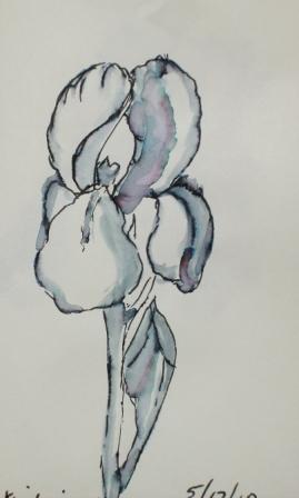 Ink Iris
I finally got a taste of a non-tropical spring while visiting our daughter in Portland, Oregon. She had beautiful iris in her garden that were begging to be sketched. I did this one with an Elegant Writer, a calligraphy pen that is not permanent. When you touch water to it you can get lovely shading and even some variation in color.
While we were there we went to the Portland Rose Garden and even though most of the roses were not quite ready to bloom, there were a few early ones that were stunning. With all the photos I took I'll have a lot of references to work with.
Thursday, May 13, 2010
More Blue Herons
 Back Water Heron
Blue Heron on the Beach
Acrylic on 5 x 7 Canvas Boards
I'm still in the heron painting mode. It seems these little canvas boards lend themselves to this type of painting. Sometimes people just want to take home a little momento of something from their trip to Florida. This is what I'm hoping, anyway. Now to find some simple frames to set them off and I'm good to go to the gallery with them.
Friday, May 07, 2010
Blackbird Has Spoken
 Gallery Wrapped Canvas Acrylic 6"X 12"
I can't believe how long it's been since my last post. I must be busier than I think. Sometimes I have several works going at the same time and nothing is finished. This little acrylic had a layer of bead gel on it at first which I didn't care for so I covered it over with molding paste and made some designs on it. I didn't have a plan, I was just playing with it and trying to make it interesting. When the molding paste dried I started painting it and finally came up with a sunrise, moon set motif and the song "Morning Has Broken" came to mind. With that on my brain I had to have a blackbird. I found a blackbird picture and made a gel transfer. If you've ever made a gel transfer you know this takes lots of layers of gel medium on the picture and this can take several days for the layers to dry and get thick enough. Finally I rubbed the paper off and was able to cut my blackbird out and fasten him to the painting. I did have to darken him with black paint though, I didn't think the transfer turned out dark enough.
Tuesday, April 27, 2010
The Gallery with Happy Colors

The gallery owner, Peggy McTeague, wanted a picture of her gallery painted and printed on card stock. I painted the front of the WildChild Gallery from a picture that I took since to sit in the street and paint would be a very dangerous thing to do. I painted it on paper with acrylic paint. I wanted to try to paint with acrylics in a watercolor style. It was an interesting experiment and I think it worked out quite well. You may wonder at the bright exterior color. This is a common thing to do in this area; it's a Caribbean influence, I think. The brightness of the sun seems to beg for bright colors. Dark earth tones just wouldn't do. People show up in their blacks and tans from the North and before you know it, they are sporting colorful outfits, too.
Monday, April 26, 2010
Sea Shore Heron 2

This is the second in my series of a blue heron on the shore of the Gulf of Mexico. These are mini paintings, 3X5, that are donated to our art league every year for fund raising. These will go on sale next February during our annual sale.
It's painted in acrylic on a canvas board.
Friday, April 23, 2010
Sea Shore Heron

I'm determined to get my mini paintings done for next year so that I don't have to scramble to get them handed in on time. I have some good photos that I took of a heron walking on the beach so he's my subject this year. People were asking for more bird pictures this year so I hope that's what they want in 2011. This is the first of four that I finished. It's done in acrylic on a 4X5 canvas board. It's pretty small by my standards but that's the size we are required to do. I find it easier to paint that small with acrylic as opposed to watercolor. I guess it's easier to correct mistakes by painting over them.
Thursday, April 15, 2010
Undersea Step 3, 4


When I looked at step three I thought the turtles didn't look like they were underwater and that the bottom of the sea wasn't integrated with the rest of the picture. The solution, I thought, would be to give it all a wash of Thalo blue, green shade. When I did that, I lost all my vibrant colors that I loved so much about the painting. Since then, I've been trying to regain some of the vibrance without making it look like everything is pasted on a background. I've never had so much difficulty with this kind of painting. Now that I'm showing it to the world, I'm having problems. It just serves to remind me not to take myself too seriously. It's only paper and pigment, get over it! The outcome will be posted soon.
Wednesday, April 14, 2010
The Auditorium

I painted this for http://virtualpaintout.blogspot.com. The assignment was to paint a scene from the Canary Islands, off the coast of Spain. I found this scene on google maps.
This is an amazing building; an auditorium in Tenerife. From the angle that I painted it looks like a huge ocean liner. You can tell it's size by comparing the size of the car. I'm not very good at cars so I only painted one. Also, there are two tiny figures towards the back on the right side. The people look dwarfed by this building. It looks like it's all white so what I'm painting is the shadows on the sides, quite fun. The view from the side of the building (maybe someone else will paint that) the building reminds me of a giant conquistador's helmet.
Tuesday, April 13, 2010
Organizing magazine articles


It must be a spring thing, I've finished a project to preserve the art magazine articles that I really like. I came to the conclusion that in order to avoid renting a warehouse for my art things I have to pare down some things. The first thing I decided to tackle is my collection of years of art magazines. Each month each exhibitor is required to staff the gallery at our art league for one afternoon. In between talking to guests I began going through my magazines and cutting out the articles and artwork that I really liked. These were put in sheet protectors and put in a ring binder. I ended up with two ring binders, but it's much better and more organized than a stack of magazines. I can easily find subjects or artists by going to the appropriate section. It took quite a few afternoons over several months but I'm finally finished up to 2009.
P.S. I'm still working on the Undersea painting, too.
Tuesday, April 06, 2010
Undersea, step 2

In step 2 I'm beginning to define the undersea elements; the shells, rocks and coral shapes. I've also found some jelly fish shapes that I will try to use to make some more interesting shapes besides the turtles that are beginning to show up. I think the colors are very pleasing and I am going at it slowly. I love this part of the painting, doing the negative shapes and making the subjects come alive. At least that is what I hope to do. I'm finding little fish peeking out behind coral and others in the light area. I'm really enjoying this process.
Sunday, April 04, 2010
Wave Boarders
 Wave-boarders 5x7
While at Daytona Beach with the grandchildren this week end I got my little paint box out and painted some wave scenes. The kids were having such fun with their wave boards riding the waves into the shore. I painted this little scene for them to take home as a souvenir. They are the two on the left. There were a lot of kids out there in that cold water; at least to me 65 degrees is too cold to swim in but they didn't seem to mind. The day was partly sunny, but perfect for beaching.
Tuesday, March 30, 2010
Undersea, step one.

This is step one for an undersea painting I started a few weeks ago. I wet the paper on both sides and while it was really wet I started adding the colors. Then I added various items to make textures; torn wax paper, coffee filters, rice papers, and gauze for the stringy stuff. This is my favorite way to make an under painting or background. I planned ahead that it would have turtles, fish, coral, shells and rocks. I have used salt for texture, too but I'm getting away from that because I've been told that it will attract moisture, especially in our FL humidity.
I have another picture of it as it has progressed and will post that tomorrow.
Sunday, March 28, 2010
Those Piles of Old Paintings

I have what my son calls "lots of inventory". Sometimes I look through it for ideas and to evaluate what went wrong, what worked. I did a half sheet watercolor of pink poppies years ago and it was nice but not too exciting. As I looked at it I thought the three poppies near the top would look nice framed by themselves. I cut them right out of the picture and darkened the sky around them. I think they will make an attractive note card and a nice 8X10 piece. Perhaps I can try a Myrna Wacknov experiment with the rest of the painting, a little gesso, a little collage and who knows? It may turn out good or it may just be a fun exercise.
Friday, March 26, 2010
Orange on Found Paper
 I started my painting session yesterday at the Art League by finding some donated paper. I wasn't sure what it was so I decided to do a 20 minute challenge with it. One of the artists brought juice oranges to share and I decided that would make a good subject. As I began my painting I noticed that the water in my paint was being sucked up by the blotter-like paper. Indeed, if my brush was really wet, it soaked right through the paper. Since the pigment doesn't lay on the surface more than a nano-second, it's very difficult to blend colors on the paper. I worked in layers, instead. I think the paper is for print making. I may try a mono print on it and see how it works out.
My scan of the painting is more vivid than that of the actual painting, I noticed the same thing with the pears. I tried to adjust it with my picture program but wasn't happy with any of the results. Does anyone have any ideas that aren't too technical? Thanks.
Sunday, March 21, 2010
Stavanger, Norway 2
 This is another little painting that I did for the Virtual paint out blog. The assignment was Stavanger Norway and I found this house on the water with what must be a wonderful view. It's hard to see on my painting but there was even a bridge between the far hills. I love the simplicity of the house nestled down off the road and close to the water. I wonder if there is a boat of some kind moored back there out of view. This has been a lot of fun to go to a virtual place and paint. I have really enjoyed the trip, especially since I know it is winter there and probably not nearly so green. I've enjoyed seeing the scenes that others have painted, too.
Subscribe to:
Posts (Atom)